Tiffany & Co.
Designing Governance: The Homepage Zones
Resolving competing marketing priorities through a strategic hierarchy that balanced brand storytelling with a guided shopping experience.
The Challenge: The Marketing Tug-of-War
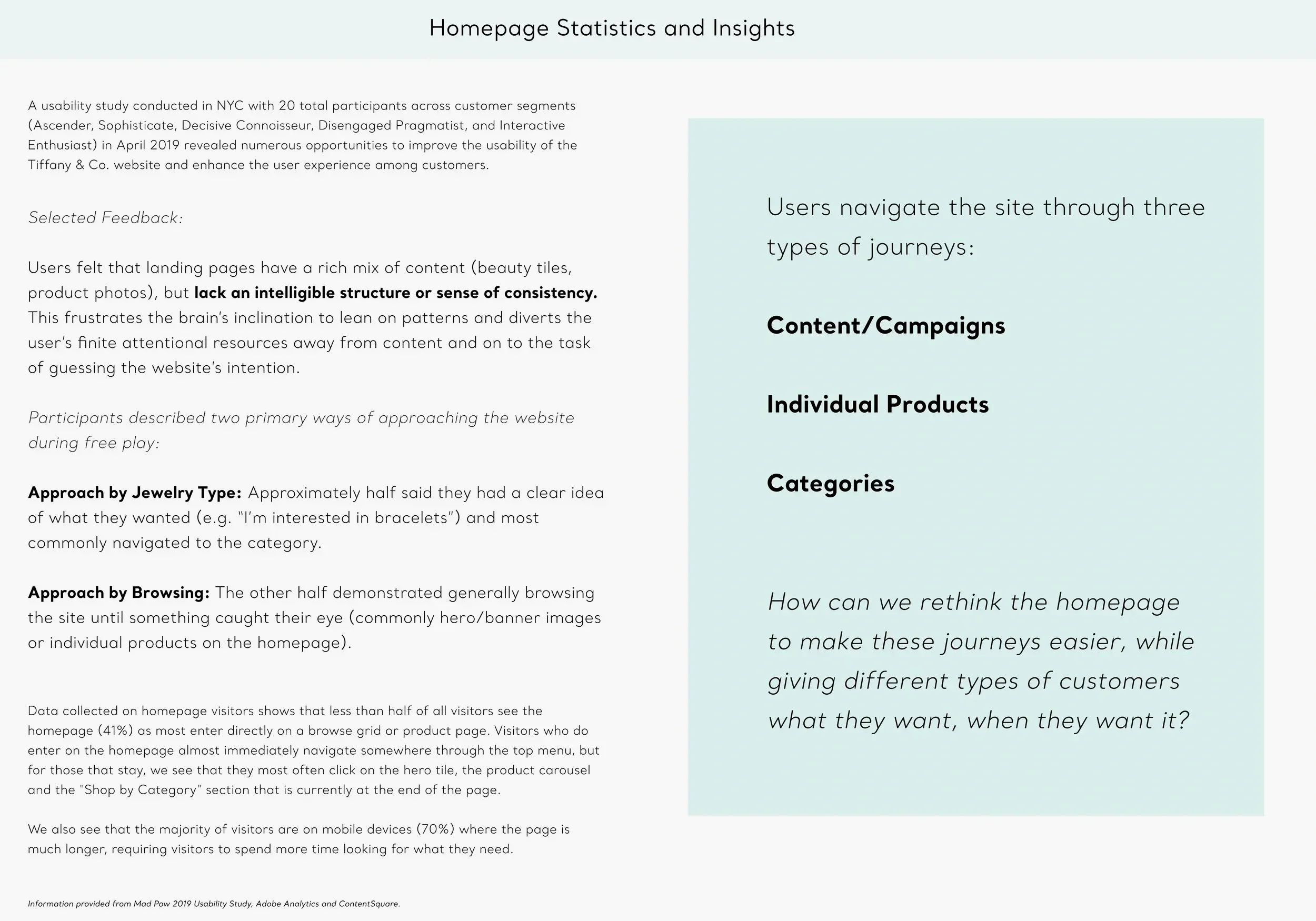
With so many high-stakes campaigns vying for attention, the Tiffany.com homepage had lost its sense of focus. Our research showed that users were struggling to find a clear starting point, often missing key collections because the hierarchy was fragmented. We needed a system that could satisfy internal marketing needs while providing a cohesive experience for our two primary personas: the ‘Sophisticate’ looking for high-end craft and the ‘Ascender’ looking for their first piece of luxury.
The Approach: A Framework for Focus
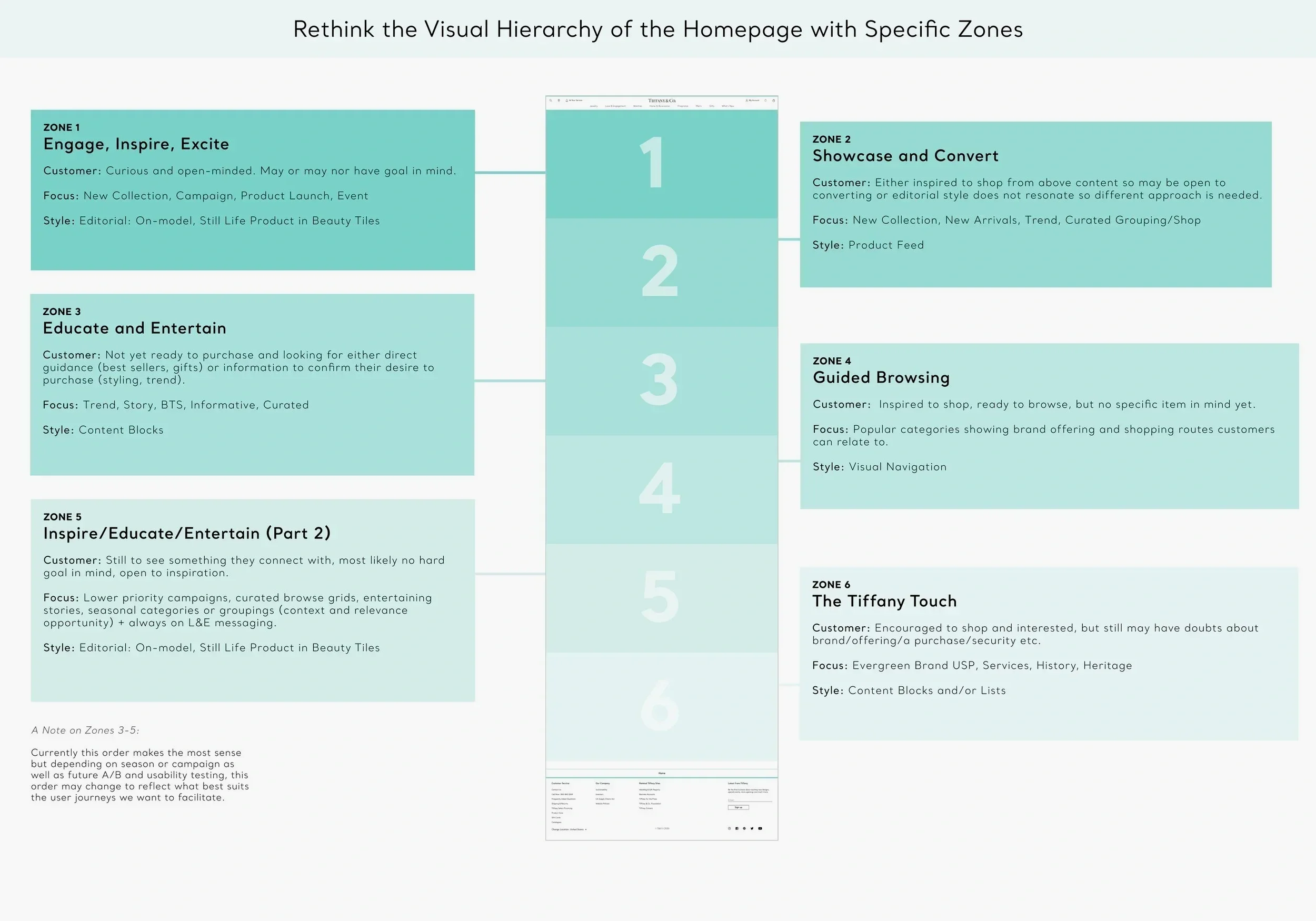
I collaborated with the Marketing and Product teams to develop a modular ‘zoning’ strategy. Instead of designing a static page, we defined physical zones: modular areas with specific rules for which components could be used. This approach allowed us to create a flexible yet disciplined layout. We used prototypes to validate this new structure with real users, ensuring that our ‘Sophisticate’ and ‘Ascender’ shoppers both felt the experience was clean, elegant, and easy to navigate.
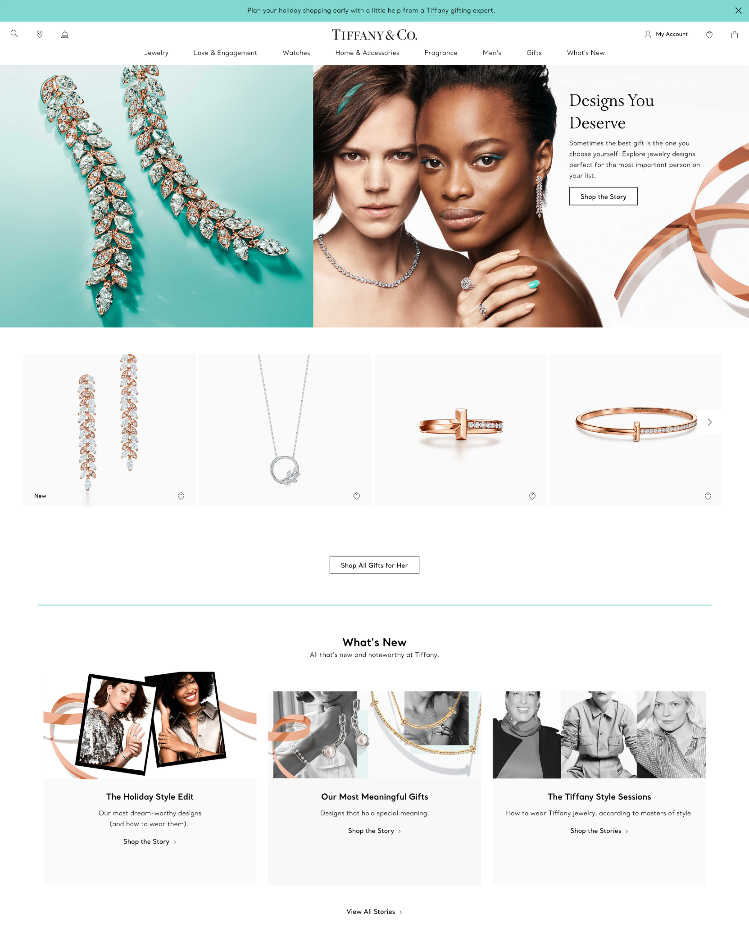
During my time at Tiffany & Co., I was tasked with solving a complex challenge: the homepage had become a battleground for competing marketing messages, leaving our users overwhelmed. I spearheaded the ‘Homepage Zones’ initiative to move beyond a first-come, first-served layout. By creating a structured zoning system, we didn't just clarify the visual hierarchy, we established a new way for the internal teams to prioritize content. This strategic shift allowed us to speak clearly to our core personas, turning a cluttered page into a seamless, inviting journey that significantly improved how users interact with the brand.
ROLE
Senior Digital Product Designer
FOCUS
Strategic Leadership, Strategic Hierarchy, Design Governance, Cross-functional Management
TIMELINE
2020
TEAM
Product Management, Engineering, Marketing, Content Strategy, Creative
Establishing Design Governance
One of the biggest wins was creating a ‘Tiered Level’ system for our internal stakeholders. I helped define how different campaigns should be categorized, from global brand moments to seasonal product focuses. By assigning these tiers to specific ‘Zones,’ we gave the Marketing team a clear roadmap for prioritization, reducing internal friction and ensuring the homepage always maintained a professional, high-end feel.
Personalizing the Journey
We used our ‘Sophisticate’ and ‘Ascender’ personas to guide how each zone functioned. For example, high-impact hero zones catered to the brand-discovery needs of the Ascender, while deeper, category-focused zones provided the guided browsing the Sophisticate expected. This ensured that no matter who was visiting, the layout felt tailored to their specific intent.
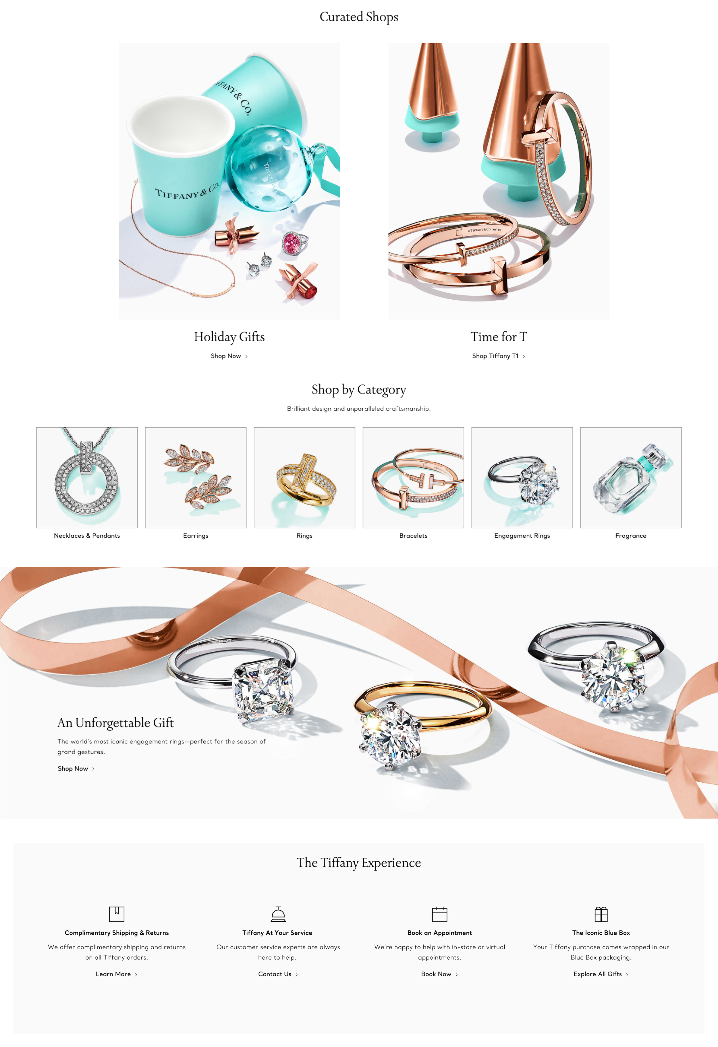
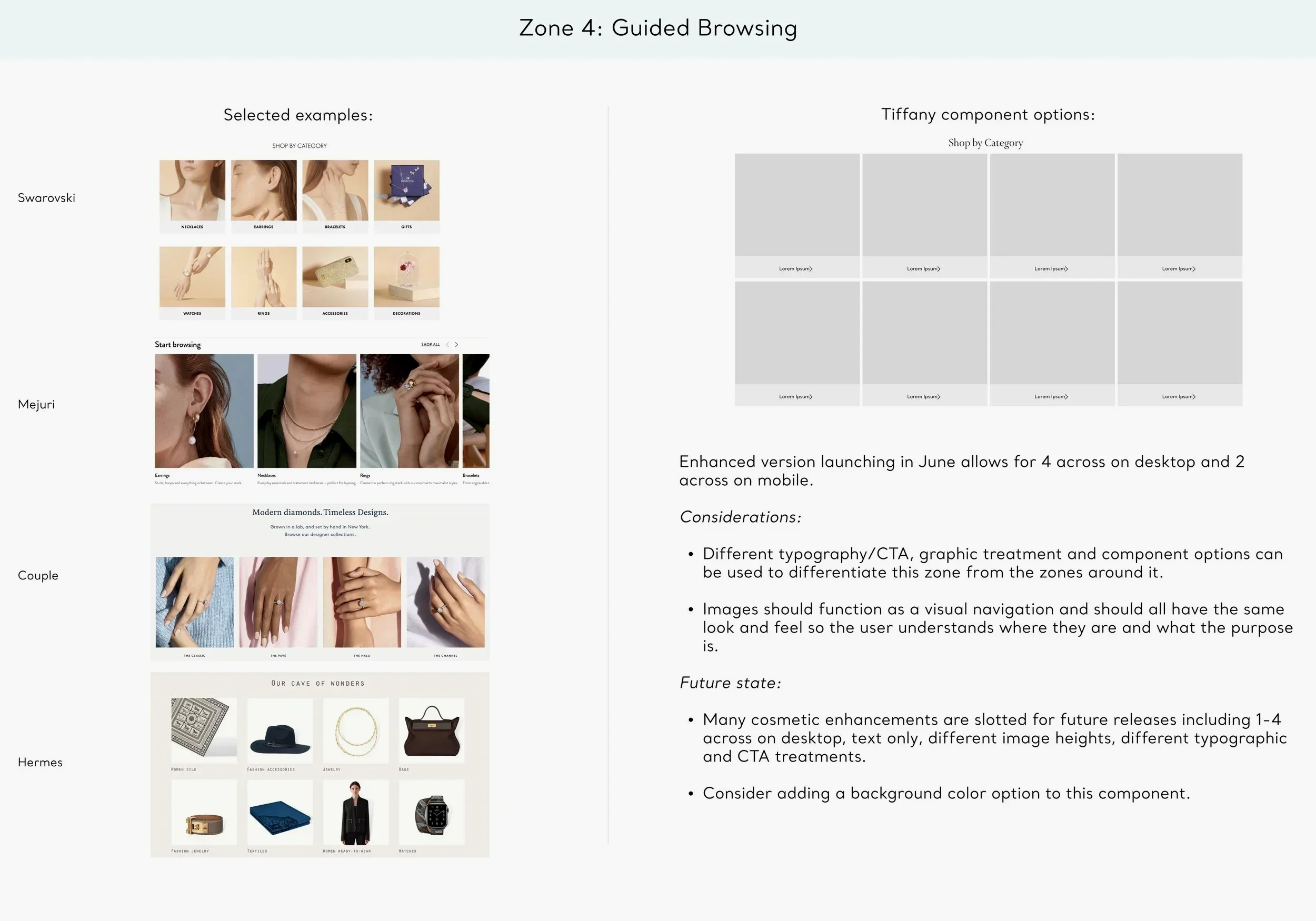
Mastering Modular Design
I defined ‘Zones’ as flexible physical areas that could house various components from our internal library. Whether it was a full-width tile for a Tier 1 hero or a grid layout for guided browsing in Zone 4, this modular system ensured the site remained technically sound and visually consistent. It gave our teams the freedom to swap content without breaking the page's overall strategic hierarchy.
Impact & Results
Improved user navigation by creating a clearer hierarchy, which led to a deeper scroll depth and a significant increase in clicks toward our sub-categories.
Elevated brand perception with users describing the new zoned layout as "modern" and "inviting," a stark contrast to the previous design which was often felt to be cluttered and overwhelming
Streamlined internal operations by providing a repeatable framework for campaign placement, allowing our marketing and content teams to make faster, more objective decisions based on tiered business priorities.