Tiffany & Co.
Guided Discovery: The Quick Links Framework
Simplifying complex product assortments through curated navigation and strategic information architecture.
The Challenge: Navigating Choice Paralysis
Following a site relaunch, our research revealed that users were often struggling to navigate our larger product categories, leading to high drop-off rates. The goal was to transform a dense product listing into a more guided experience that felt personalized and effortless. We needed a way to highlight curated collections and trending items without cluttering the interface, helping customers transition from “just browsing” to “finding the one.”
The Approach: Listen, Test, and Scale
I partnered with cross-functional teams to design a flexible component that could bridge the gap between browsing and buying. Our process was deeply rooted in validation: we first watched users interact with our prototypes to ensure our labeling and imagery were crystal clear, then ran an A/B test on the live site to measure the real-world impact. This methodology allowed us to refine the experience before rolling it out across the entire site, ensuring that the final component was a proven engine for growth.
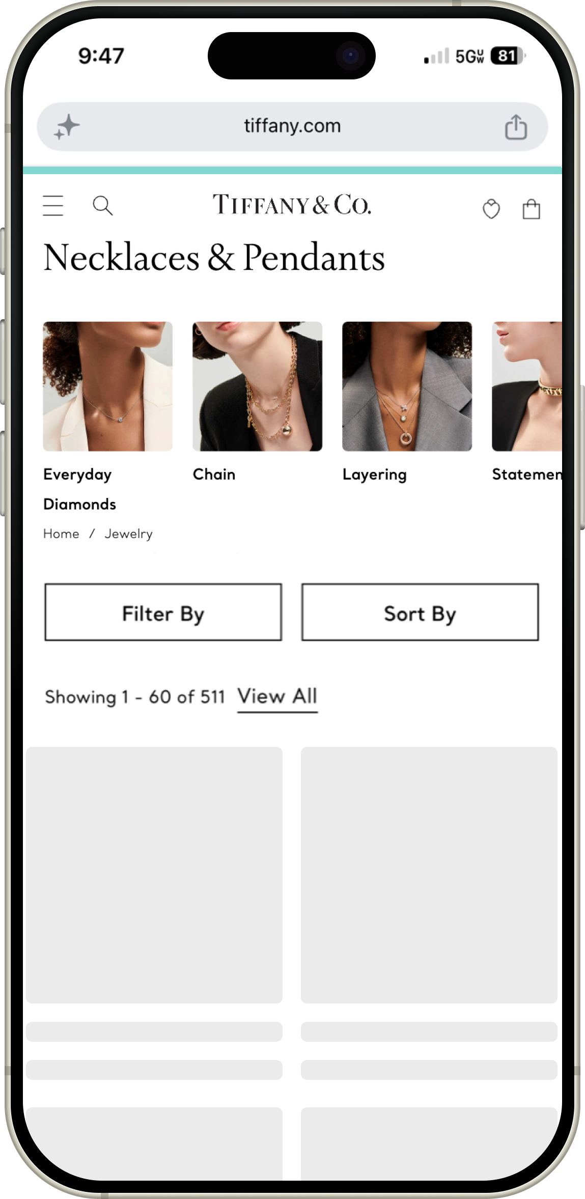
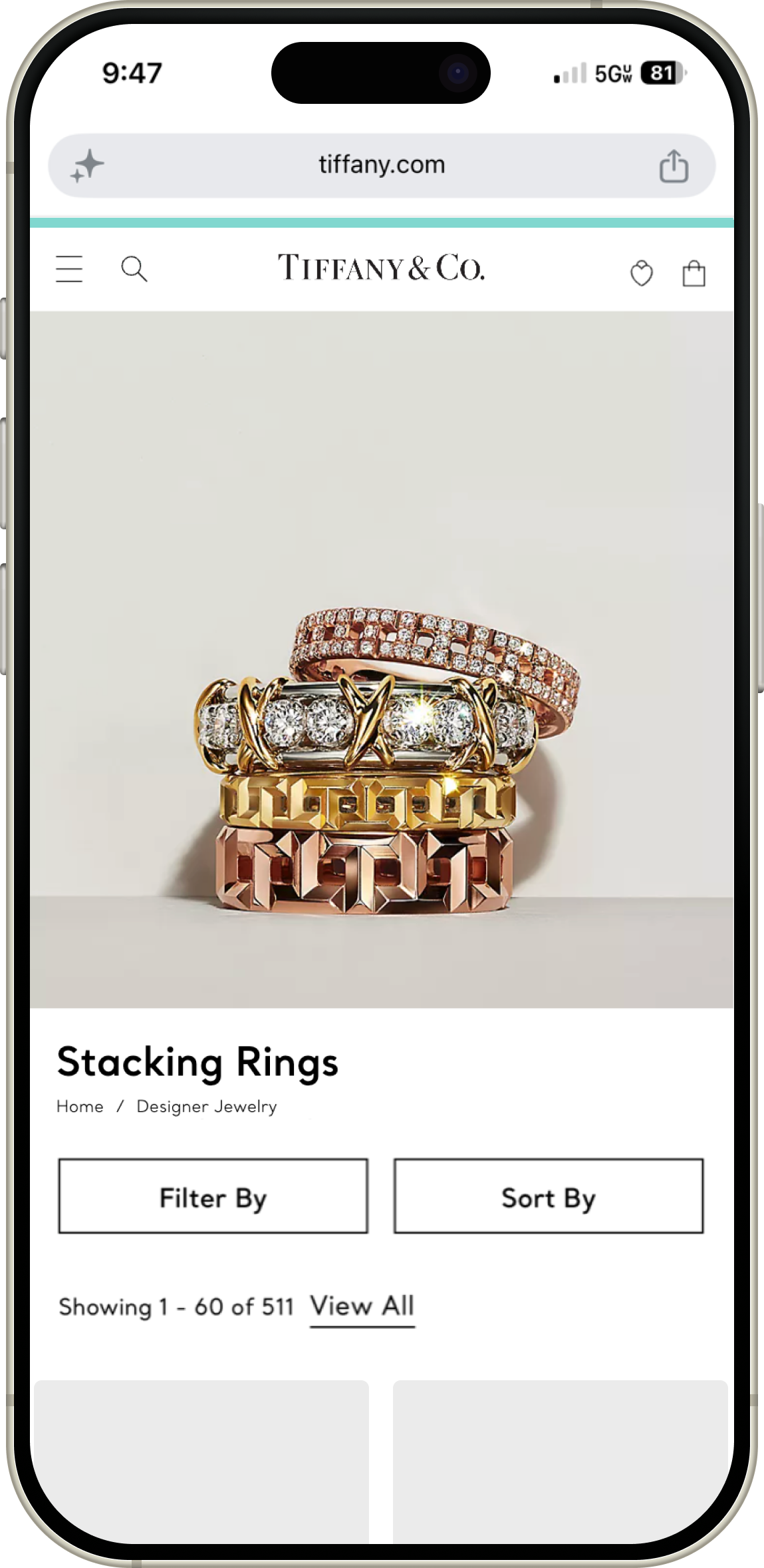
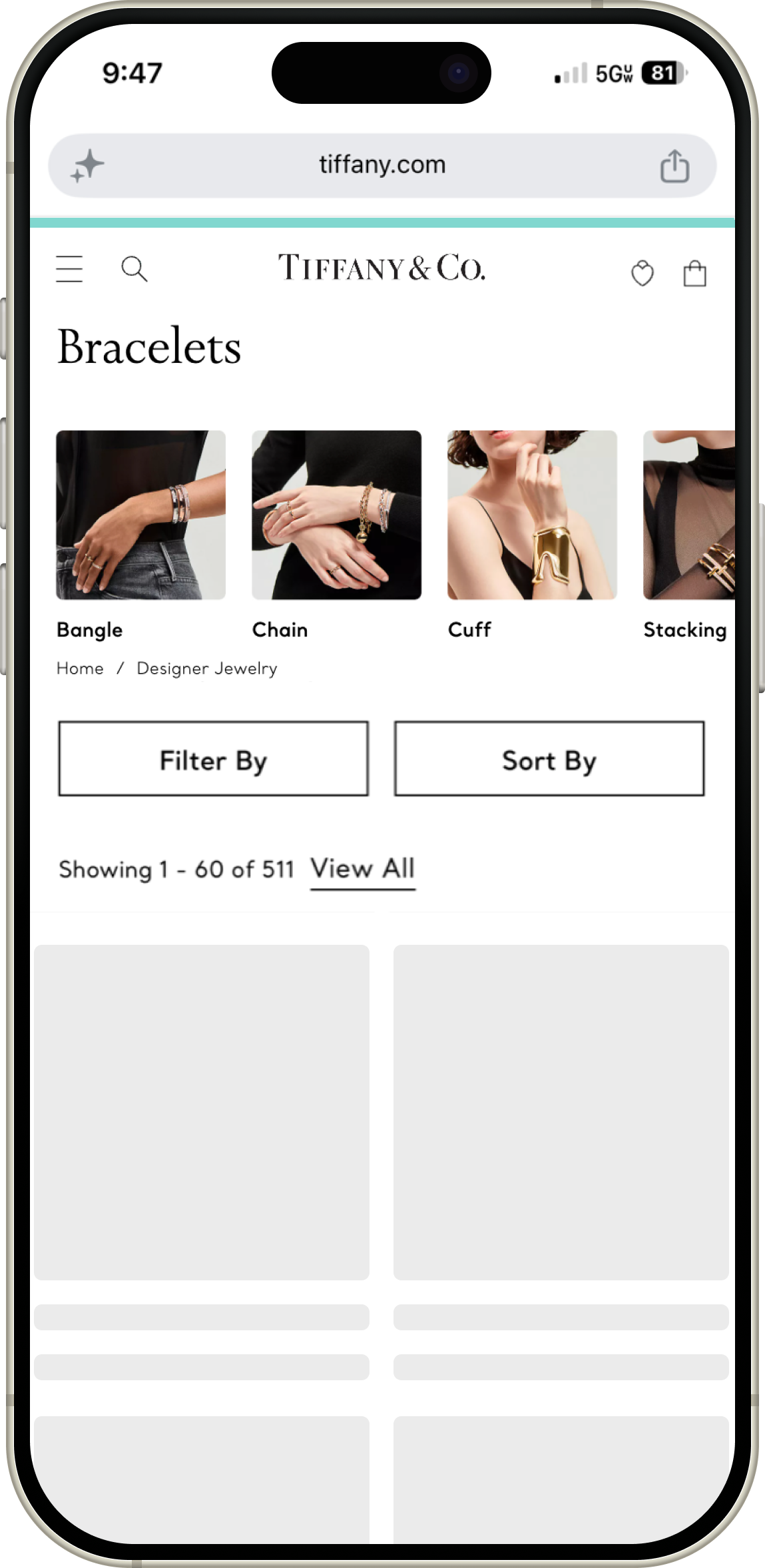
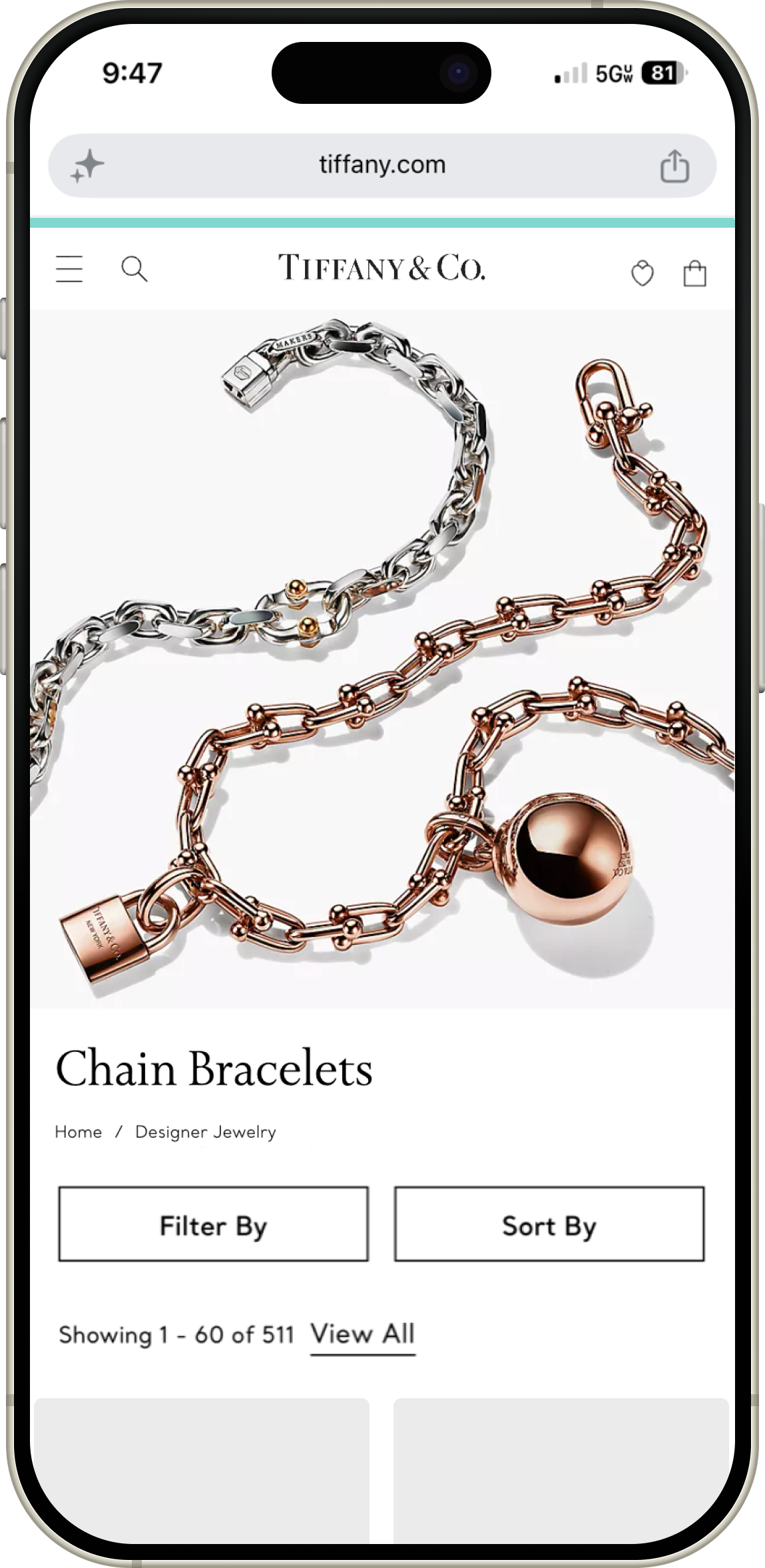
As a design leader at Tiffany & Co., I noticed that many of our shoppers felt overwhelmed when faced with our extensive product collections. To help them find exactly what they were looking for, I led the creation of ‘Quick Links,’ a curated navigation component designed to guide users toward smaller, trend-focused selections. By collaborating with our merchandising and technical teams, we built a system that simplified the path to purchase. Through a mix of hands-on user testing and live A/B testing, we proved that making the discovery process more intuitive not only improved the customer experience but also significantly boosted engagement and revenue.
ROLE
Senior Digital Product Designer
FOCUS
Strategic Leadership, Information Architecture, Navigation Strategy, Design Systems
TIMELINE
2020
TEAM
Product Management, Engineering, Merchandising, Content Strategy, Creative
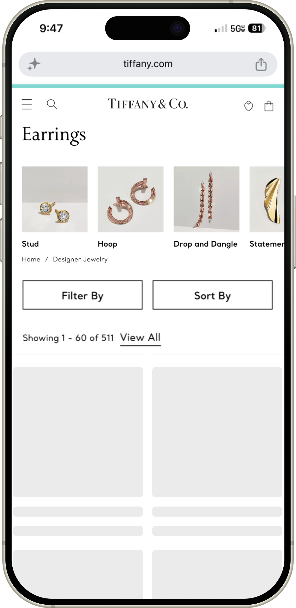
Decoding User Intent
We started by synthesizing consumer research to understand where shoppers were getting stuck. I worked closely with the Merchandising team to identify which trends and search terms mattered most to our audience. This ensured our “Quick Links” weren't just random shortcuts, but were actually answering the specific questions and interests our customers had in mind.
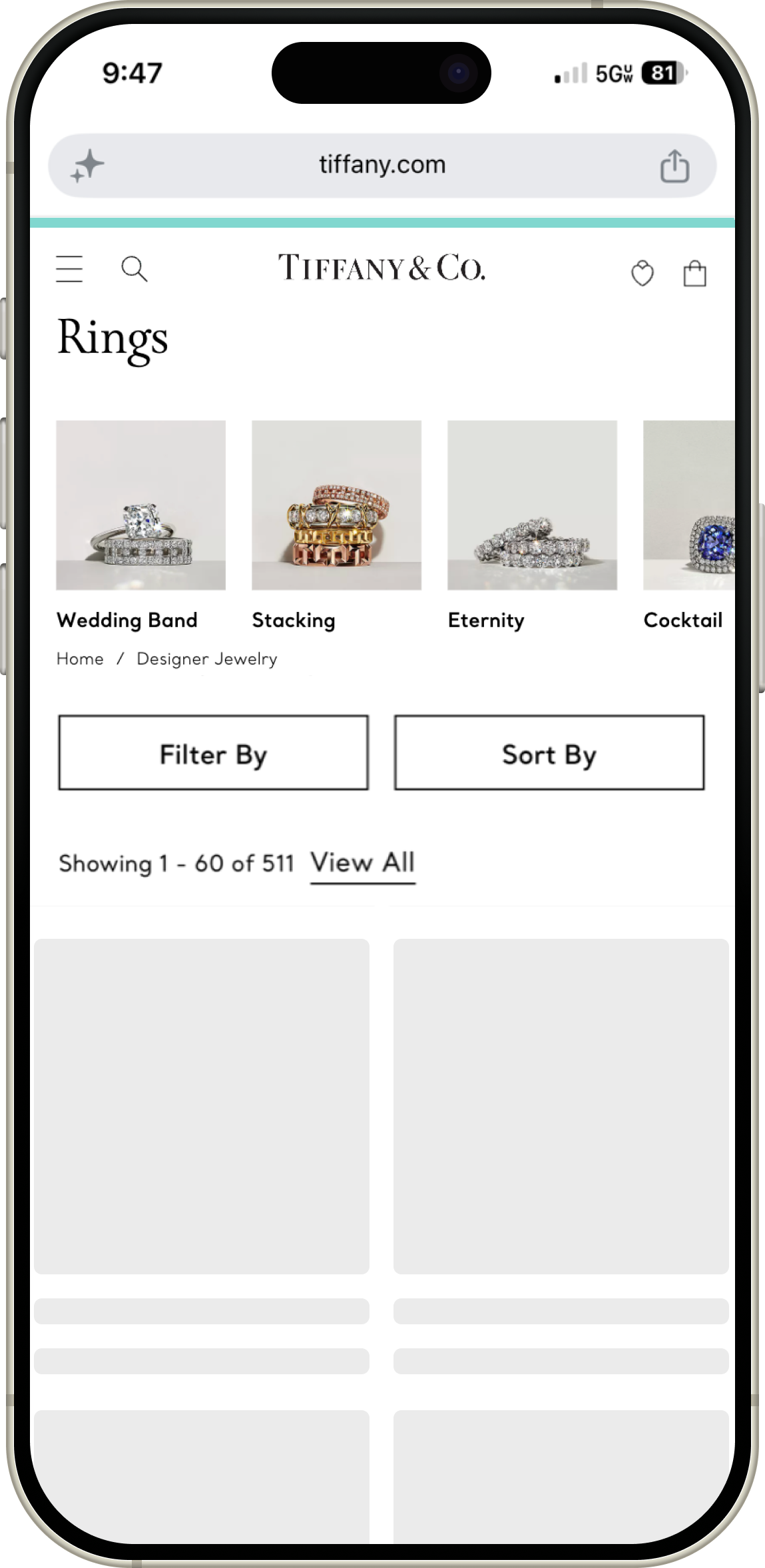
Refining the Language
In our prototyping phase, we focused heavily on nomenclature. By observing real users as they interacted with our mockups, we were able to iterate on the names and images of our curated links. This helped us make sure that every category name felt intuitive and inviting, ensuring shoppers knew exactly what they were getting before they even clicked.
Building for the Future
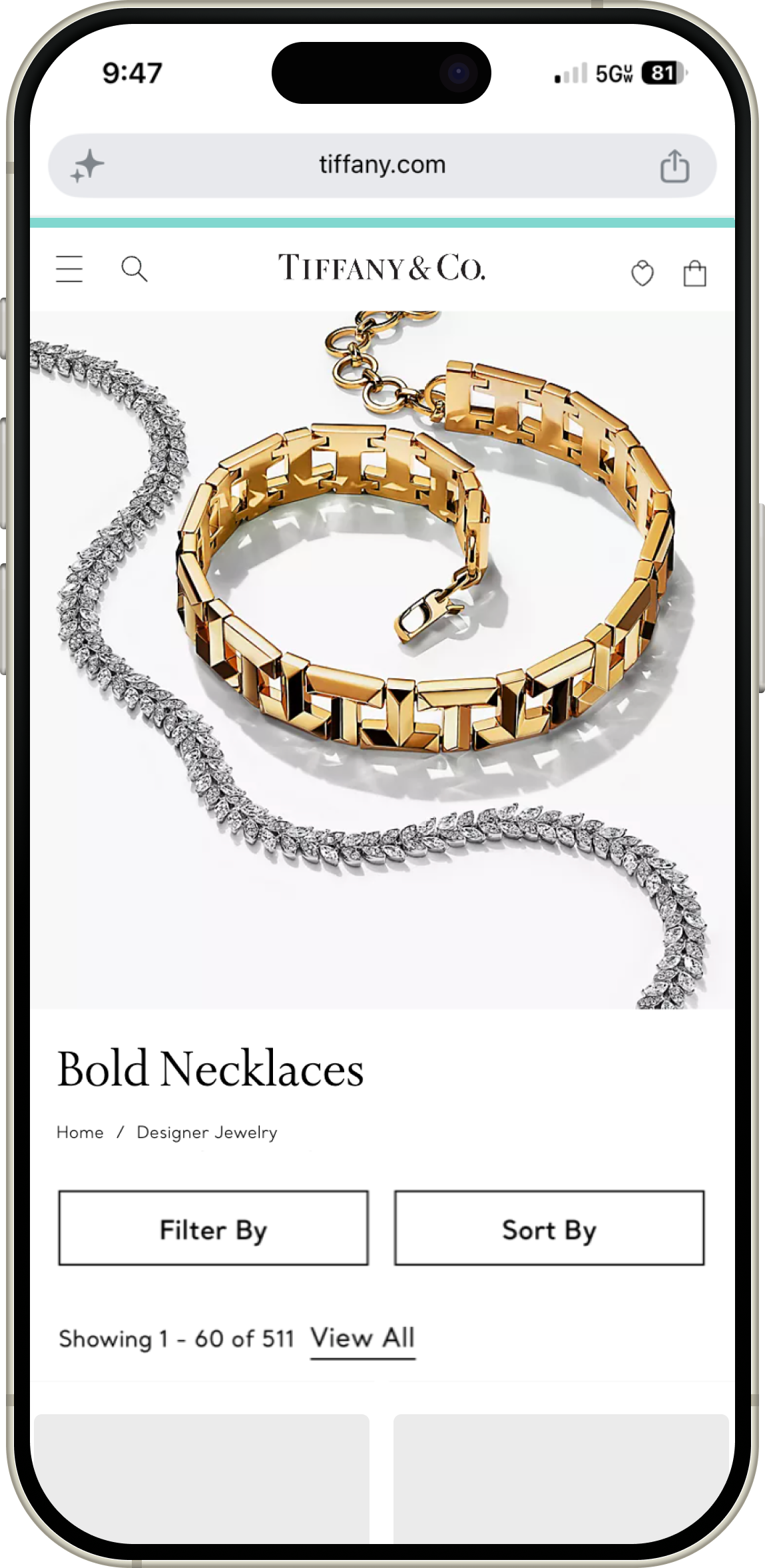
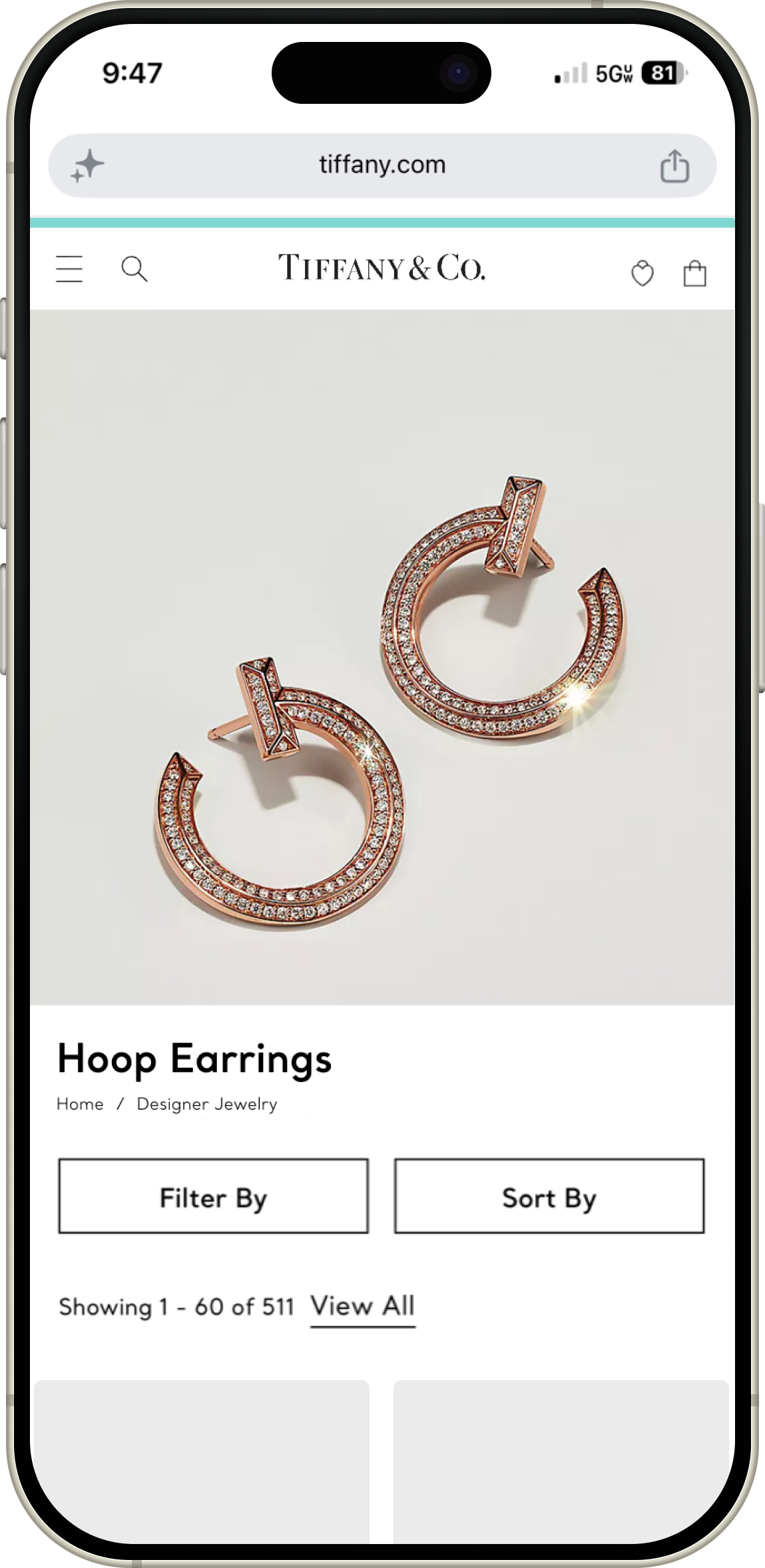
After proving the component's value, I developed a strategy to expand its reach. We successfully deployed Quick Links across multiple product categories and the homepage, creating a standardized design system component. This allowed the merchandising and editorial teams to easily highlight current trends across the entire digital ecosystem.
Impact & Results
Accelerated product discovery by providing a more direct path to curated collections, which contributed to meaningful revenue growth from 2020 through 2022.
Simplified the customer journey by reducing choice paralysis, resulting in stronger conversion rates and deeper engagement for shoppers who used the feature.
Established a scalable navigation framework that now serves as a key tool for our global teams, allowing them to highlight commercial and editorial trends with ease.