TIFFANY & CO.
Designing Governance and The Homepage Zones
I redesigned the homepage to balance competing marketing goals with user intent. In user testing, we achieved a perfect 100% navigation score on mobile, an 85% satisfaction rating, and the explicit preference of 24 out of 28 participants.
Role
Senior Digital Product Designer
Focus
Strategic Leadership, Strategic Hierarchy, Design Governance, Cross-functional Management
Timeline
2020
Team
Product Management, Engineering, Marketing, Content Strategy, Creative
The Challenge
Bridging Content and Luxury Storytelling
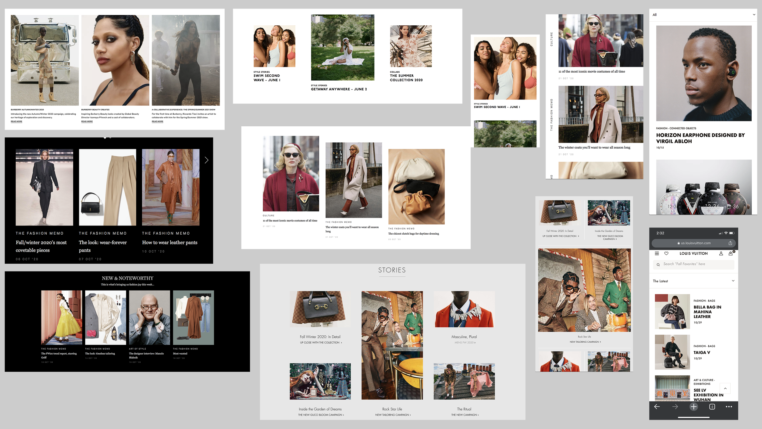
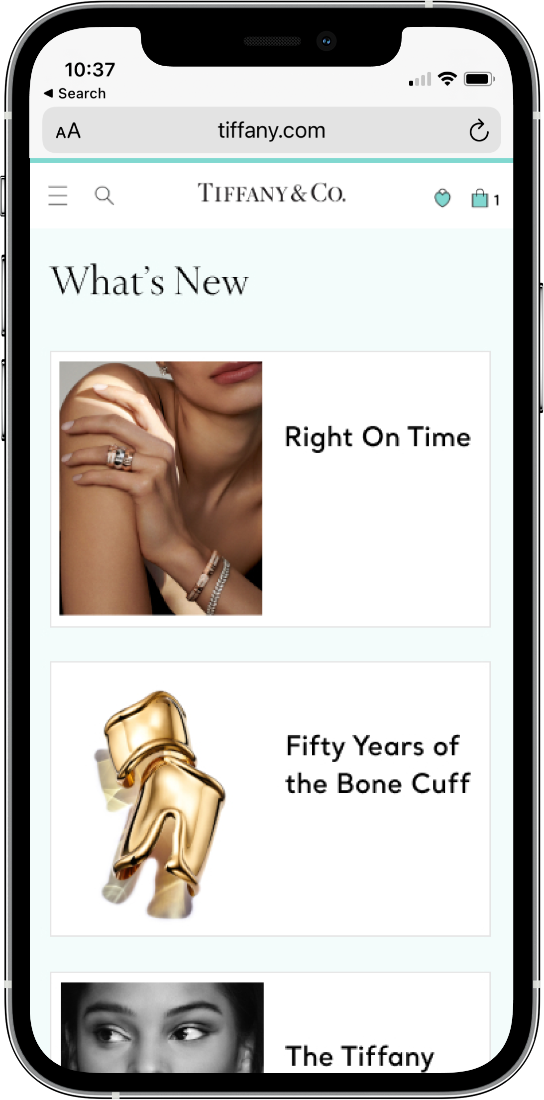
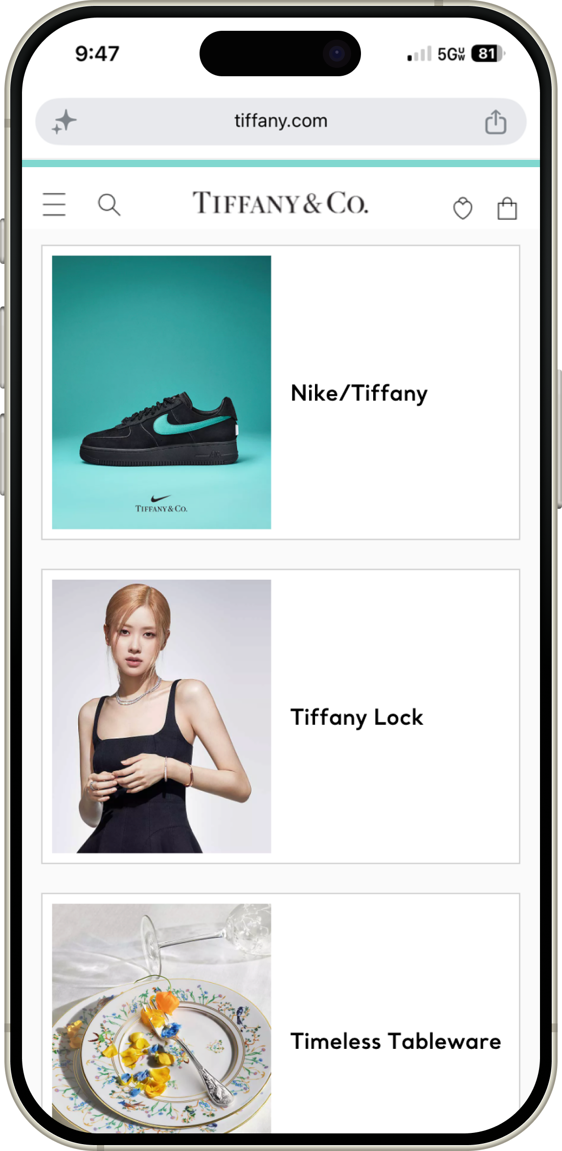
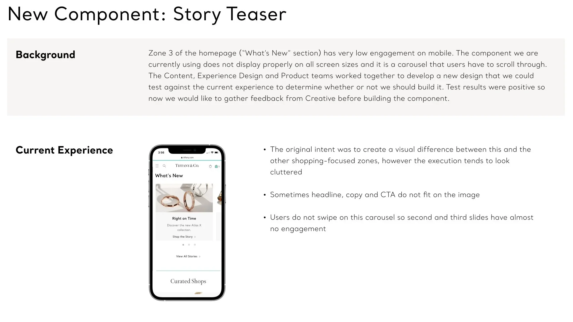
Tiffany & Co. produces world-class editorial content, and our historical data proved that users who engaged with these brand stories demonstrated a significantly higher conversion rate. However, this rich storytelling was buried deep within the site structure, entirely hidden from the mobile homepage where 70% of our web traffic originated.
The legacy mobile homepage relied on a cluttered, text-heavy swipe carousel that rendered poorly on smaller viewports. Because it was visually clunky and difficult to interact with, users consistently ignored it, causing us to miss a massive opportunity to connect with high-intent shoppers. As Manager of Digital Product Design, I partnered with our product, engineering, and content strategy teams to replace this fragmented experience. The goal was to design a dedicated homepage Story Teaser component that would bring these heritage narratives to the forefront without cluttering the mobile site, transforming passive content into a primary driver for product discovery.
The Approach
Cross-Functional Co-Creation and Layout Testing
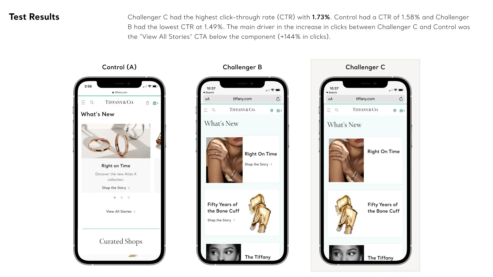
Instead of making subjective creative choices, I established a strict, data-driven framework to validate our layout hypotheses through live, on-site A/B/C testing.
Gathering Insights & Aligning Partners
Competitive Intelligence: I initiated the project by auditing the luxury digital landscape and analyzing how top-performing global brands successfully integrated storytelling blocks into their commerce funnels.
Collaborative Design Reviews: I hosted regular cross-functional meetings to share my competitive findings, present early layout concepts, and gather real-time feedback. The content strategy team was incredibly open to innovation and aligned with the goal, as they were eager to drive higher traffic to their editorial features.
Proving the Commercial Flow: I mapped out user flows that illustrated the direct behavioral correlation between storytelling engagement and bottom-of-the-funnel performance. These flows demonstrated that a more inspired, educated customer ultimately spends more, providing clear strategic alignment for the entire team.
UX Rigor
Stripping Away Friction & Usability Heuristics
Our optimization strategy was heavily anchored in Nielsen Norman usability heuristics, applying Aesthetic and Minimalist Design (Heuristic #8) to challenge standard e-commerce interface conventions.
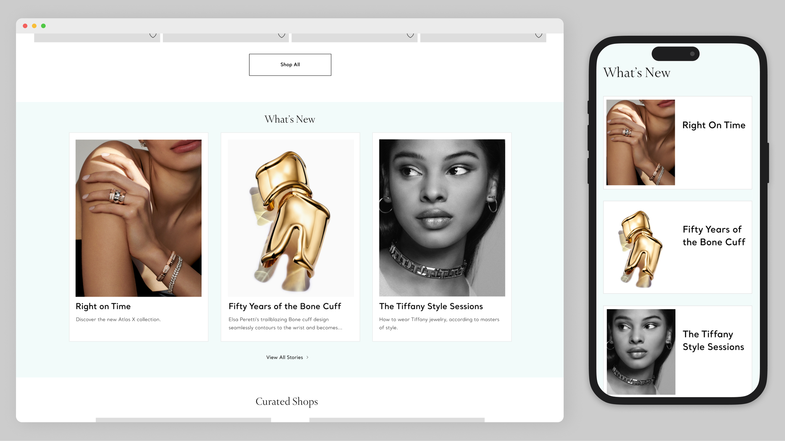
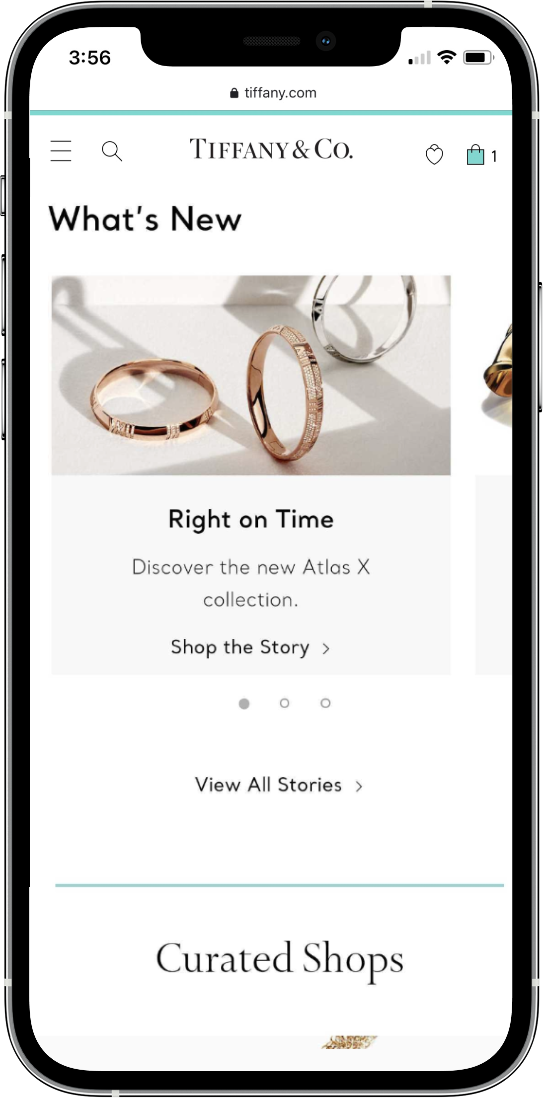
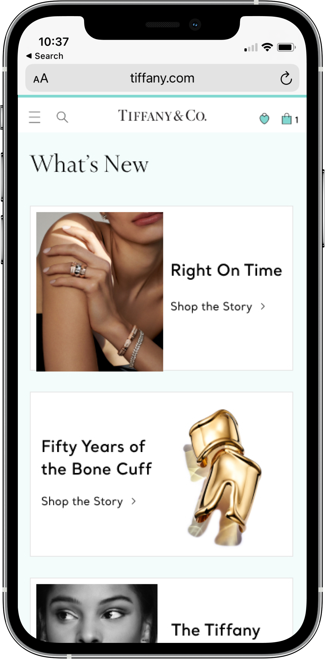
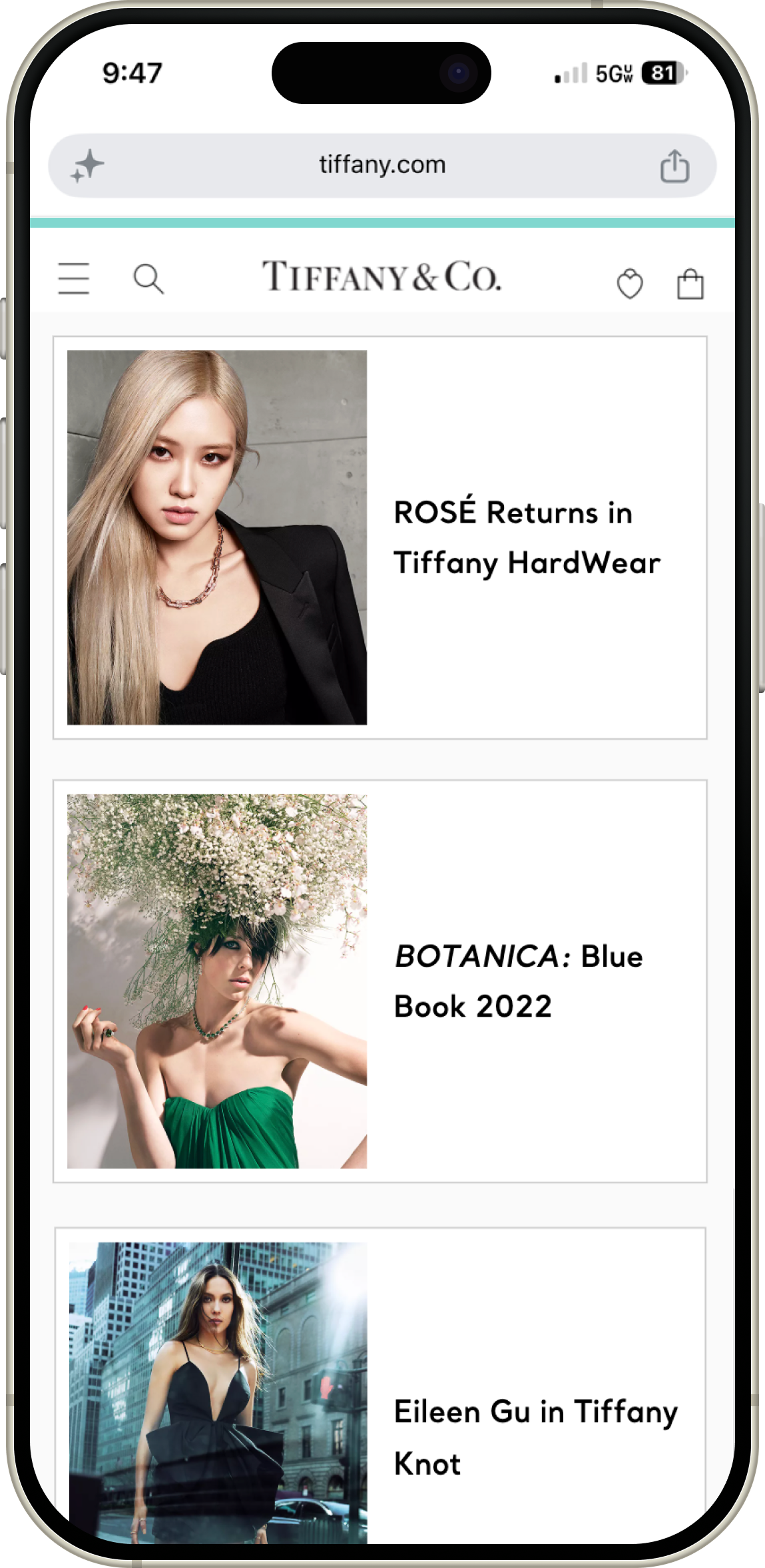
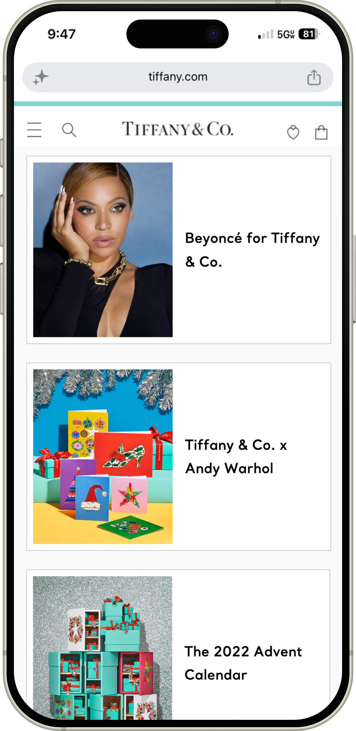
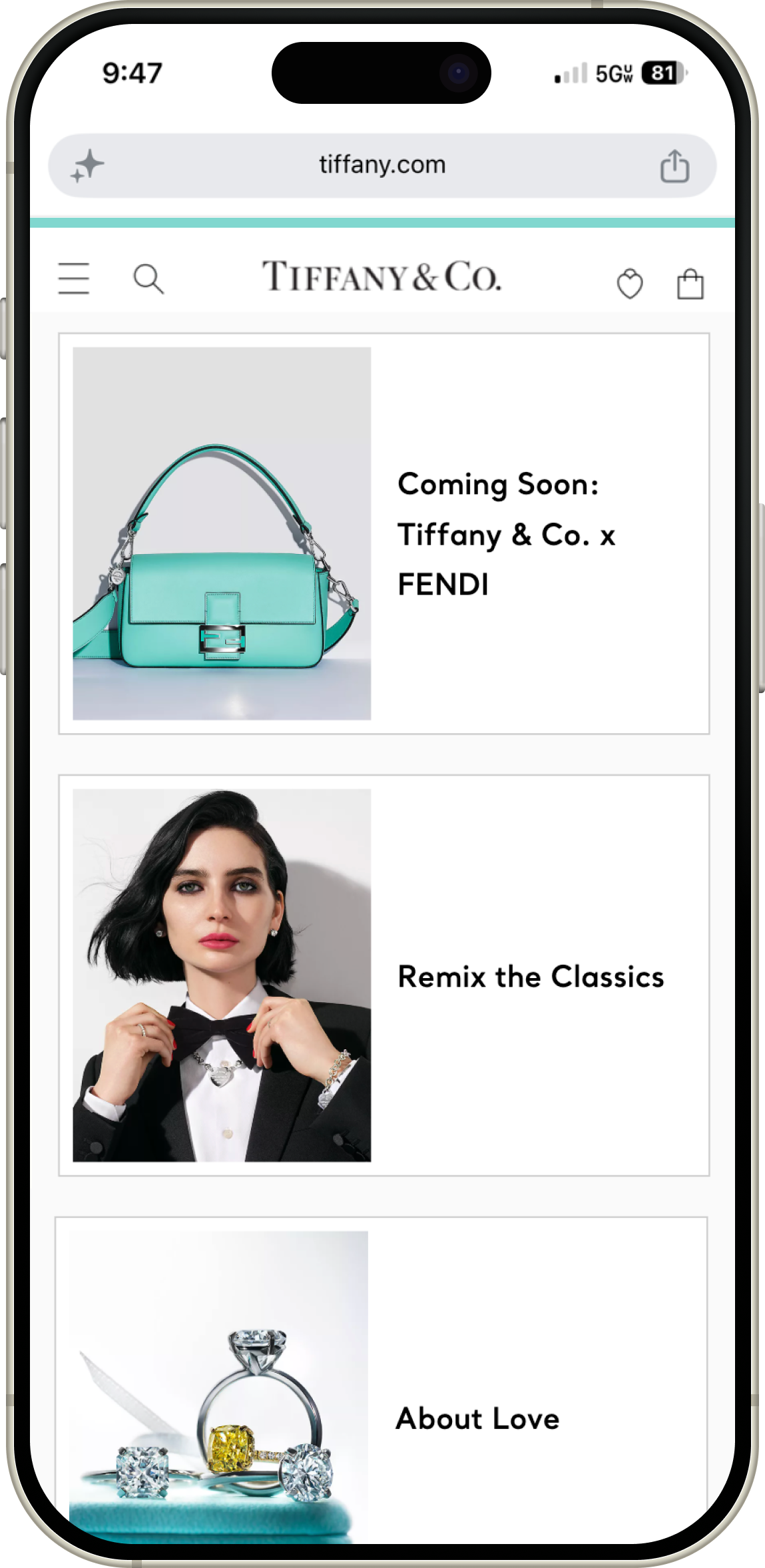
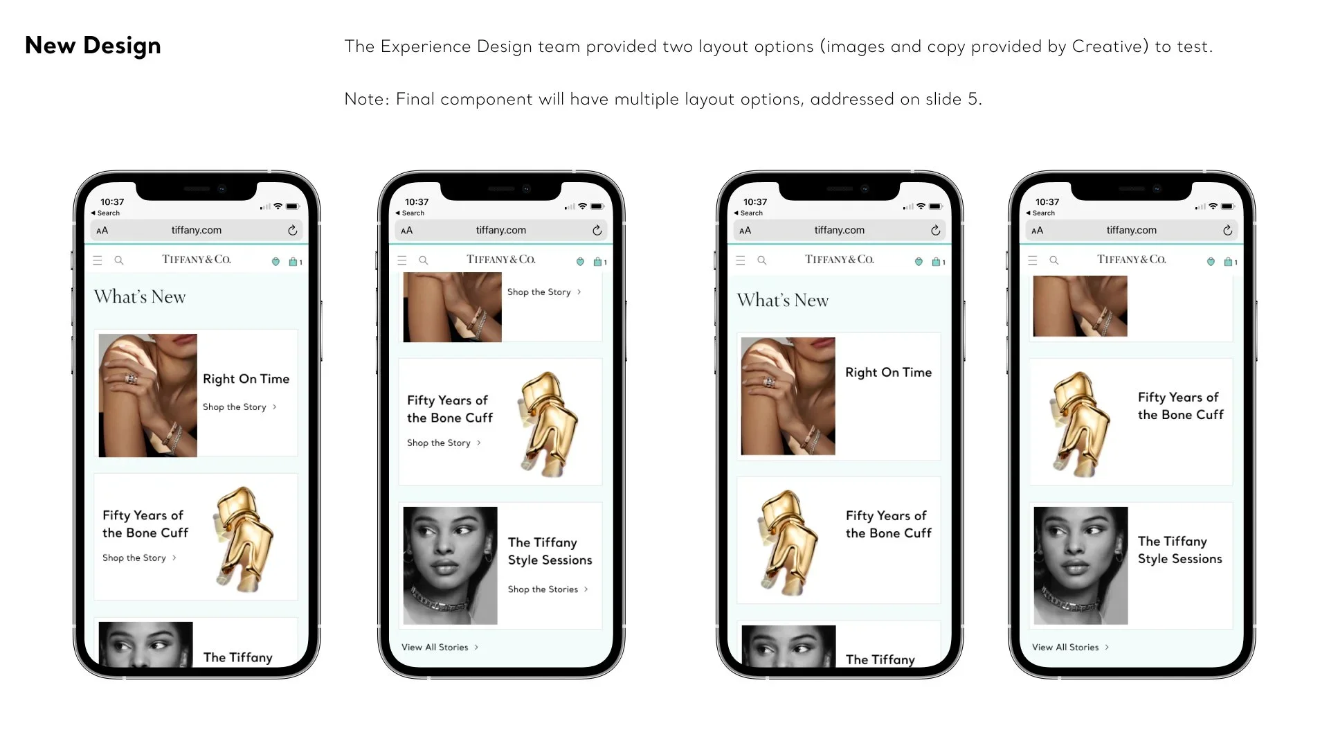
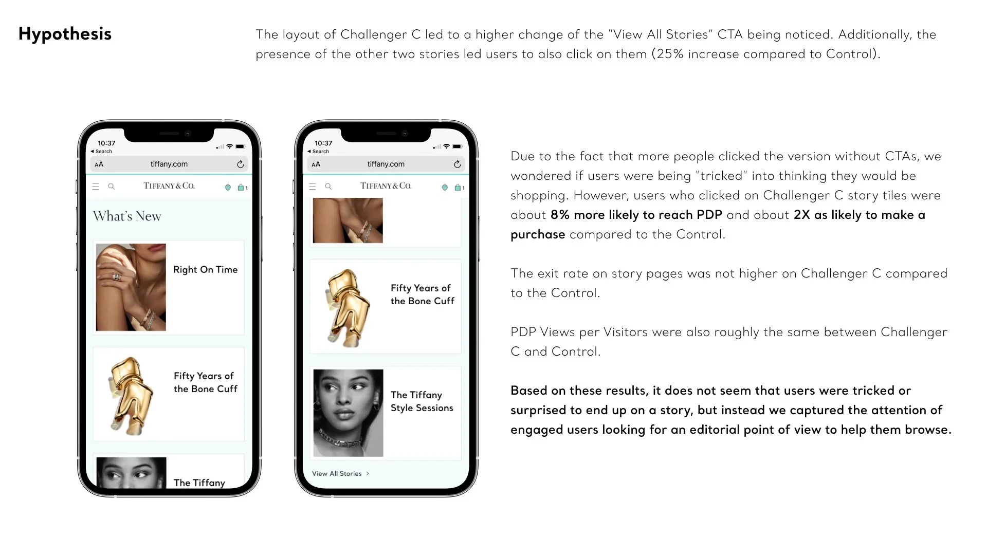
Traditional layouts rely heavily on prominent buttons and explicit instructions. However, my core design hypothesis for this project was that less is more. I engineered a specific layout variation, Challenger C, that completely stripped away traditional button components, clunky borders, and dense text descriptors. We relied instead on impactful photography and a clean, premium title layout. By making the entire large portrait block fully clickable, we lowered cognitive load. The luxury imagery itself acted as the intuitive gateway into the content, creating a seamless, deeply immersive mobile interaction.
Technical Collaboration and Design Agility
Because this new component was beautifully simple, it allowed for an exceptionally agile and iterative development cycle with our engineering partners.
An Embedded, Real-Time Feedback Loop
At Tiffany & Co., I maintained an incredibly close working relationship with the frontend development team. Rather than waiting for a formal handoff or a final staging build, the developers would send me the components incrementally as they were writing the code. This tight feedback loop allowed me to test the responsiveness live on mobile devices, giving them immediate feedback and quick design revisions when minor technical constraints arose. This collaborative approach ensured that Challenger C rendered flawlessly and loaded instantly, entirely eliminating the performance defects that plagued the legacy carousel.
Scaling the Global Component Library
Once our live A/B/C test data proved the immense commercial value of the winning visual-first design, I pivoted to scale its long-term governance. I collaborated with engineering to finalize the Story Teaser as a highly flexible, standardized component. We embedded the component and its layout variations directly into the global design system, ensuring that internal teams could autonomously deploy these high-converting blocks across different categories of the site without creating design drift or technical overhead.
Impact & Results
2X
Increase in Purchase Likelihood achieved by users who engaged with the storytelling content.
1.73%
Click-Through Rate delivered by the Challenger C version.
+8%
PDP Reach delivered by the Challenger C version.
By replacing a clunky legacy carousel with a highly optimized, visual-first component, we proved that minimalist design principles can dramatically accelerate mobile engagement while respecting the premium aesthetic of a luxury heritage brand.
Doubled E-Commerce Purchase Likelihood: Proved that editorial storytelling actively drives revenue, as users who engaged with the winning Challenger C layout were twice as likely to make a purchase and eight percent more likely to advance to a Product Detail Page.
Validated Layout Victory: Outperformed the legacy swipeable control (1.58%) and Challenger B (1.49%) in an on-site live test, with Challenger C capturing the highest engagement at a 1.73% click-through rate.
Frictionless Visual Immersion: Demonstrated that removing explicit button friction elevates premium engagement, shifting users away from transactional elements to large, stacked portrait blocks that maximized mobile click-through.
Commercialized Editorial Content: Connected the brand's heritage and craftsmanship stories directly with bottom-of-the-funnel performance by ensuring all style guides were tightly integrated with shoppable content links.
Global Standardization: Expanded the design system by establishing a permanent, highly effective responsive component template that empowers marketing and content teams to highlight trends autonomously while driving business growth.