Tiffany & Co. / 2020
Homepage Zones
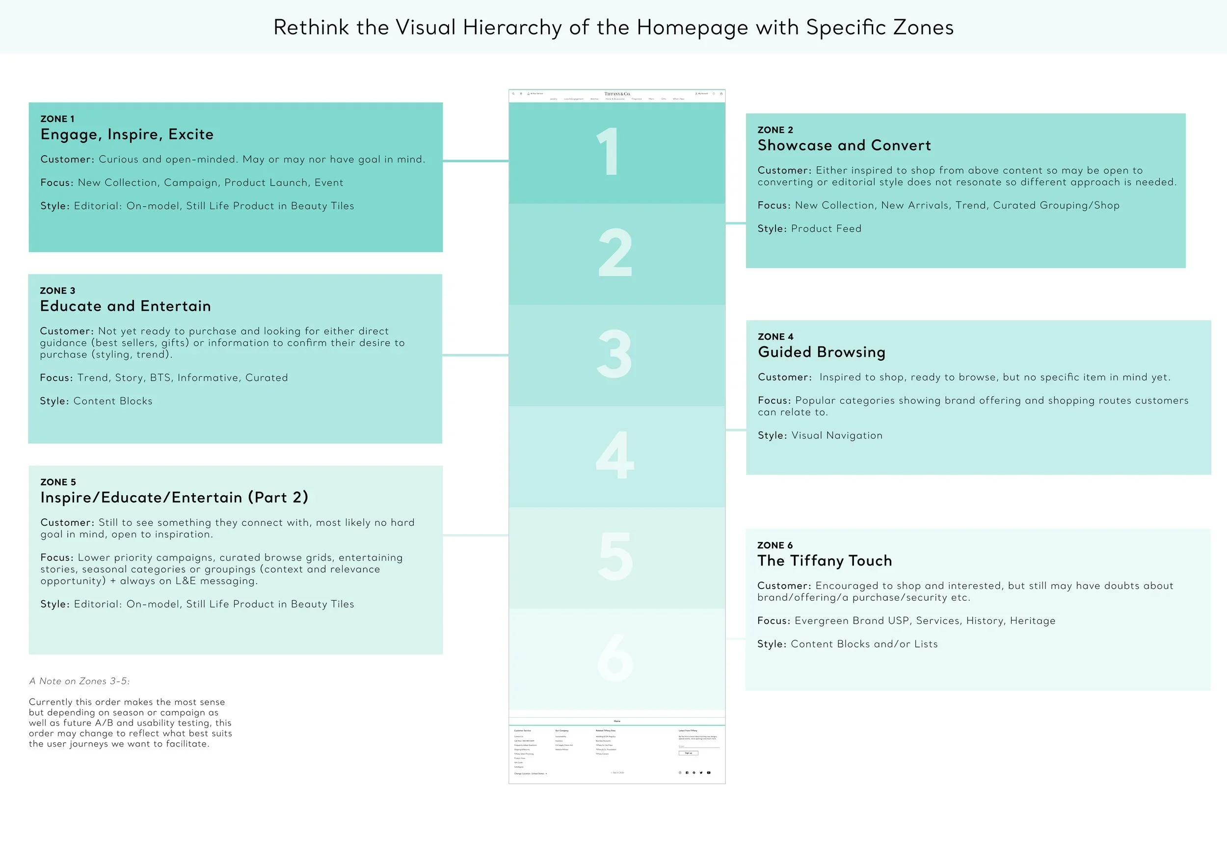
I redesigned the homepage to address competing marketing messages and a lack of visual hierarchy, which had left users unsure where to focus. Using insights from user testing, competitive research, and the internal component library, I created a structured layout called Homepage Zones that guides different types of users through the site, improving clarity, focus, and overall usability.
UX and Strategy
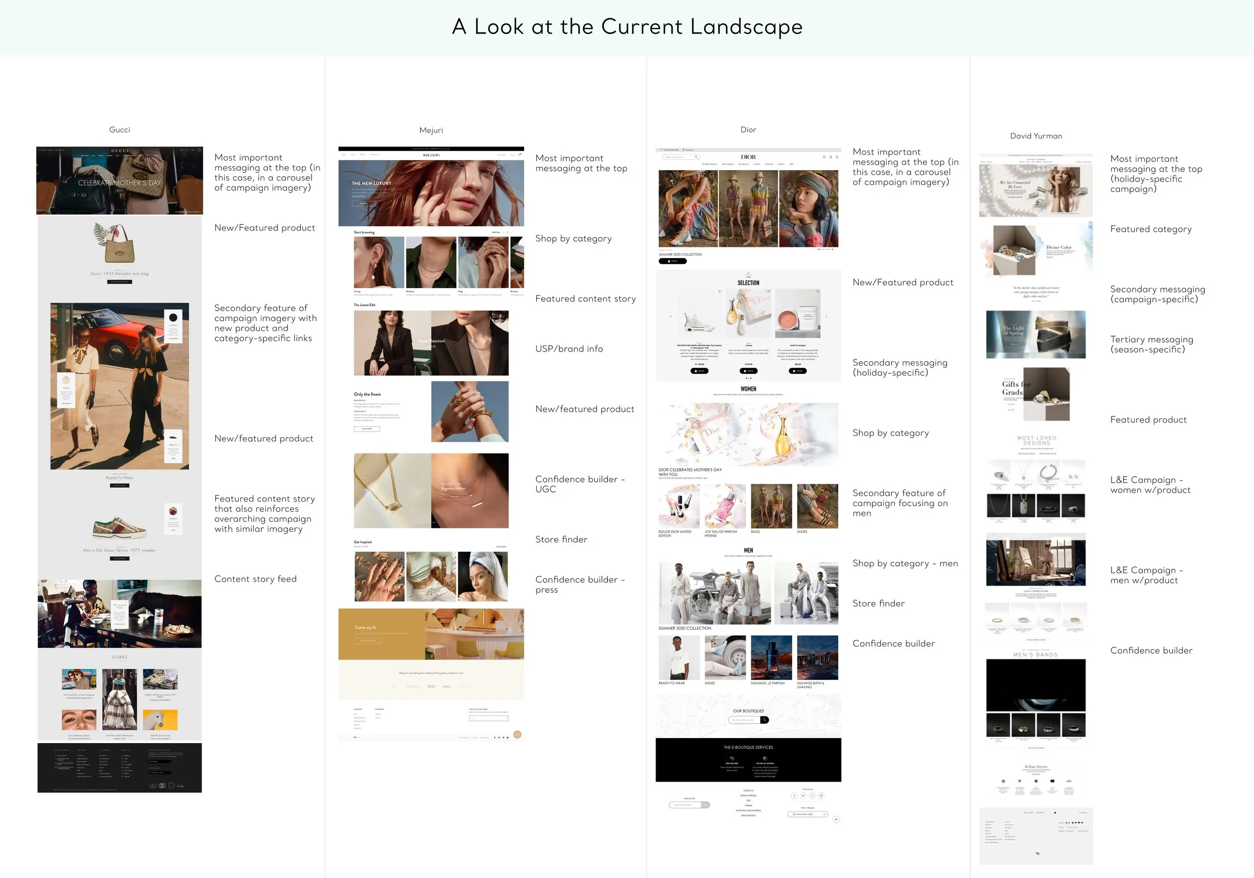
• Synthesizing consumer insights and design research
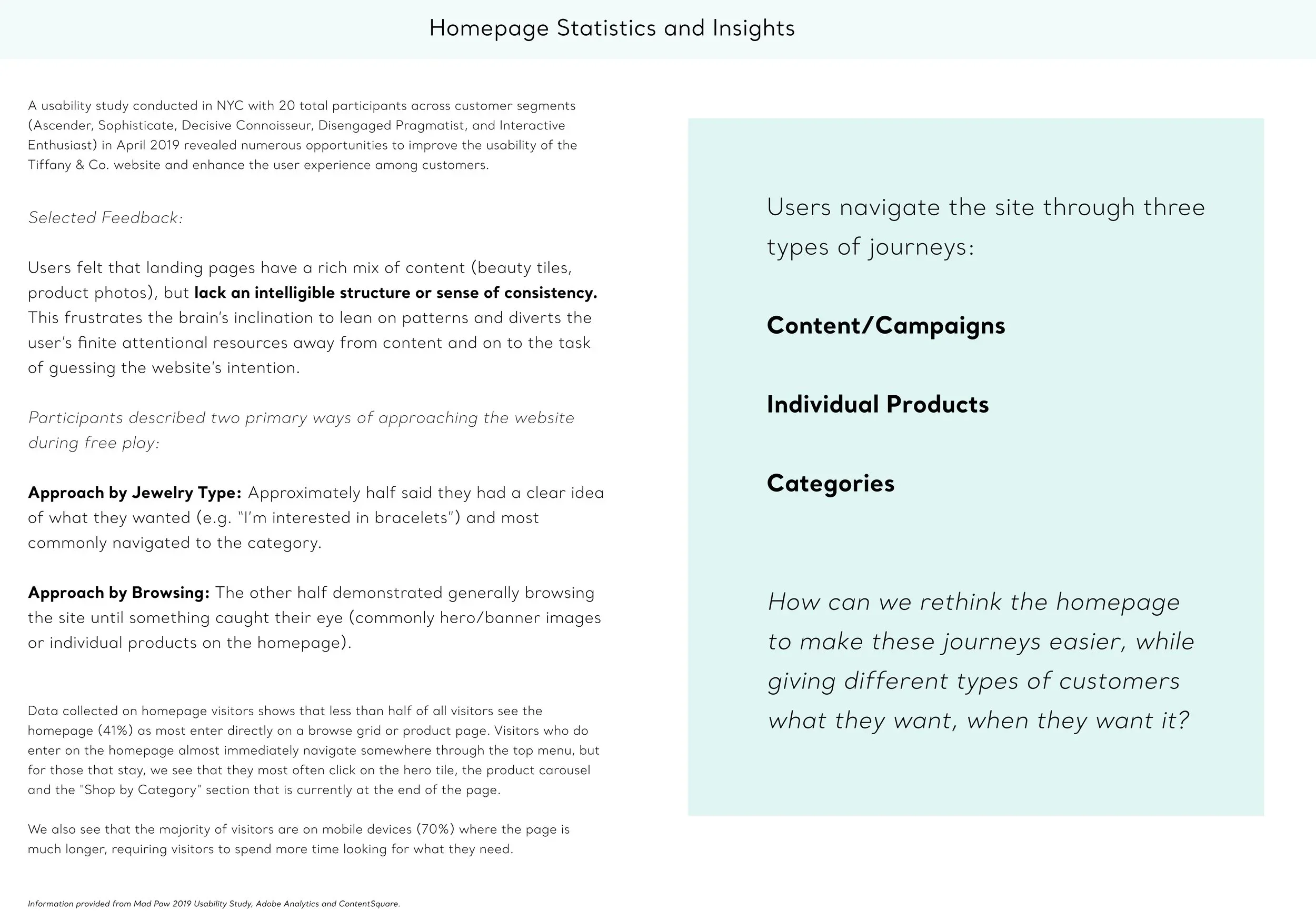
• Conducting user testing, organizing, and presenting results to senior leadership
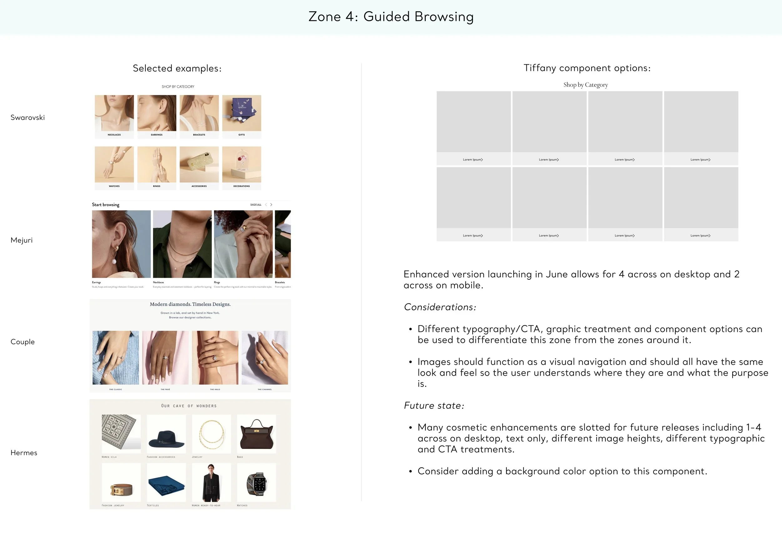
• Creating a selection of ready-to-use components from the internal library
Design
• Wireframes
• Prototypes for user testing
Results
User testing of the new “zoning” homepage showed a clear preference over the previous design, with users describing it as clean, modern, elegant, inviting, and easy to navigate compared to the old version, which felt cluttered and overwhelming. Since implementation, overall homepage metrics improved, and the zoned layout also streamlined internal decision-making by providing clear areas for campaigns based on their tier level.