TIFFANY & CO.
Bypassing Choice Paralysis Through Fast Track Discovery
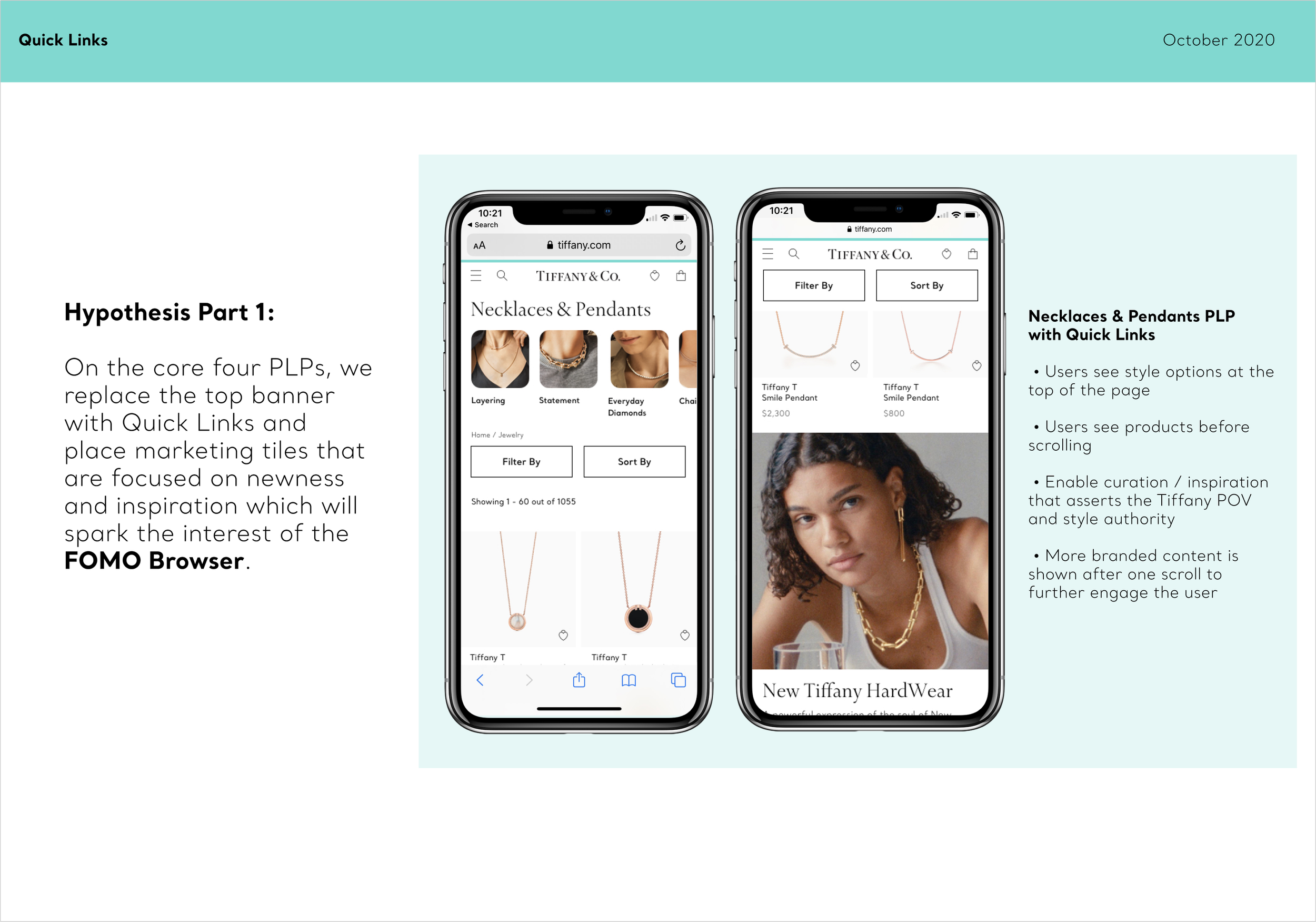
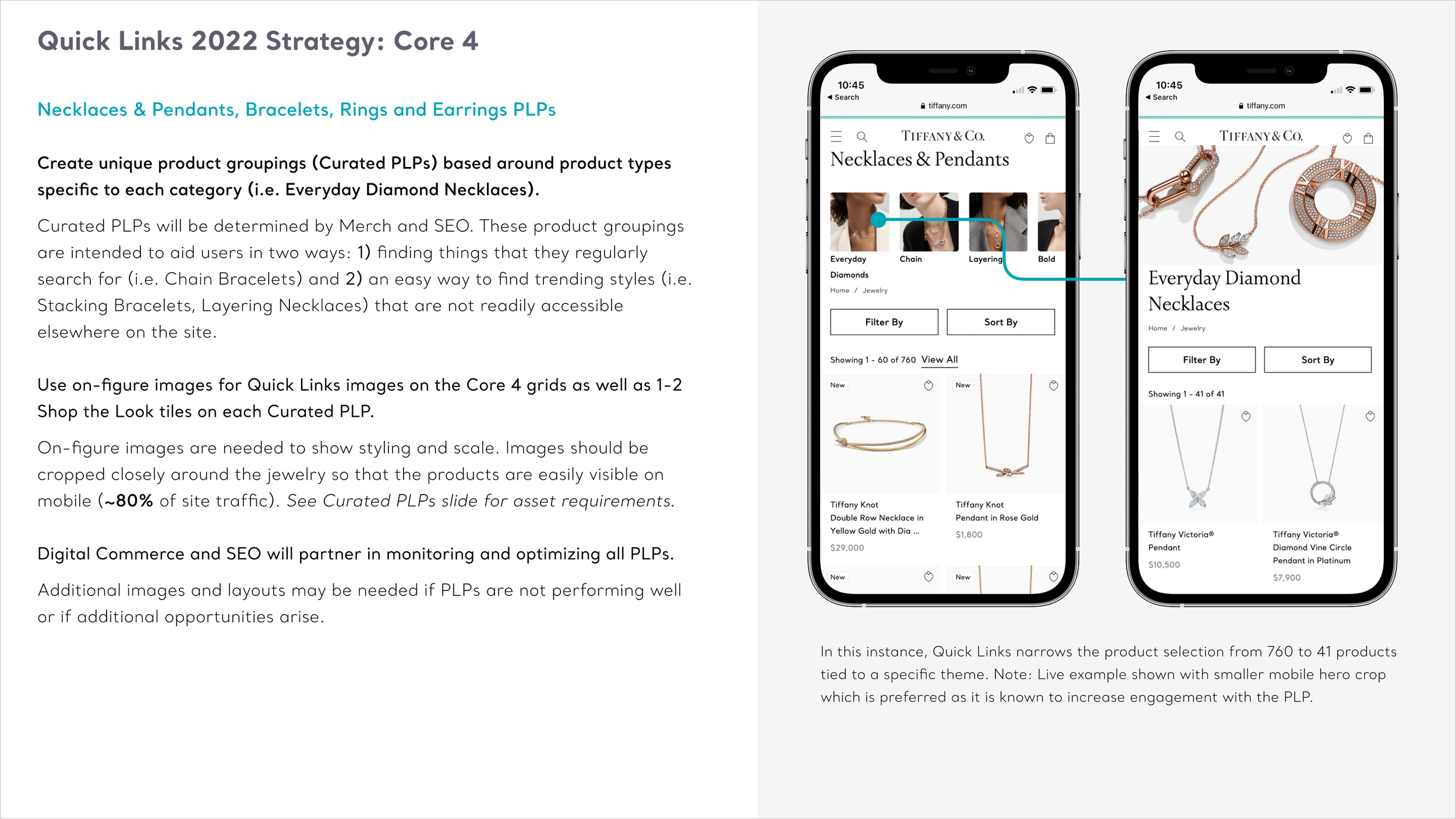
Turning search data into an intuitive browsing tool, this mobile-first visual shortcut navigation rescued luxury customers from choice paralysis and dense dropdown filters. The new component triggered a massive +50% spike in Revenue Per Visit.
Role
Senior Digital Product Designer
Focus
Strategic Leadership, Information Architecture, Navigation Strategy, Design Systems
Timeline
8 Weeks
Team
Product Management, Engineering, Merchandising, Content Strategy, Creative
The Challenge
Navigating Choice Paralysis Post-Launch
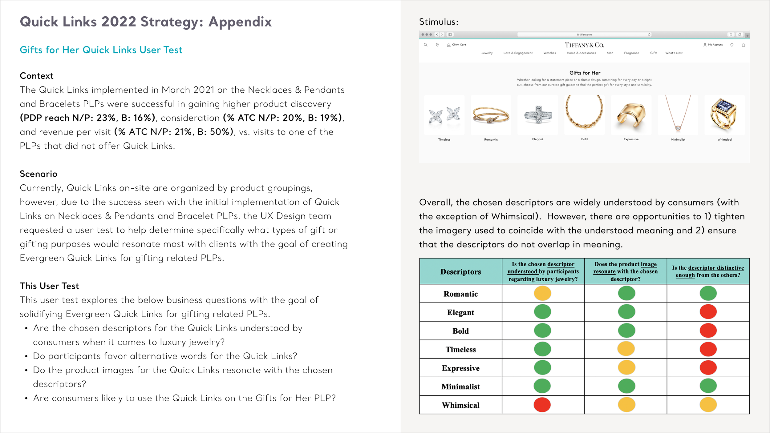
Following a major e-commerce site relaunch, data and user research revealed a significant drop-off rate on our primary category landing pages. Mobile shoppers, who made up 70% of our total traffic segment, frequently felt overwhelmed when faced with our extensive, premium product collections.
The legacy interface forced users to sift through dense product listings and manage complex, multi-layered filtering dropdowns just to browse a collection. As Senior Digital Product Designer, I recognized that we were losing high-intent buyers to choice paralysis. This was particularly true for gift-buyers who might not know the exact nomenclature of jewelry collections. The objective was to design a guided discovery framework that would transform these massive listings into a curated, high-touch shopping experience, helping customers seamlessly transition from casually browsing to finding the perfect piece.
The Approach
Data-Backed Entry Points and User Advocacy
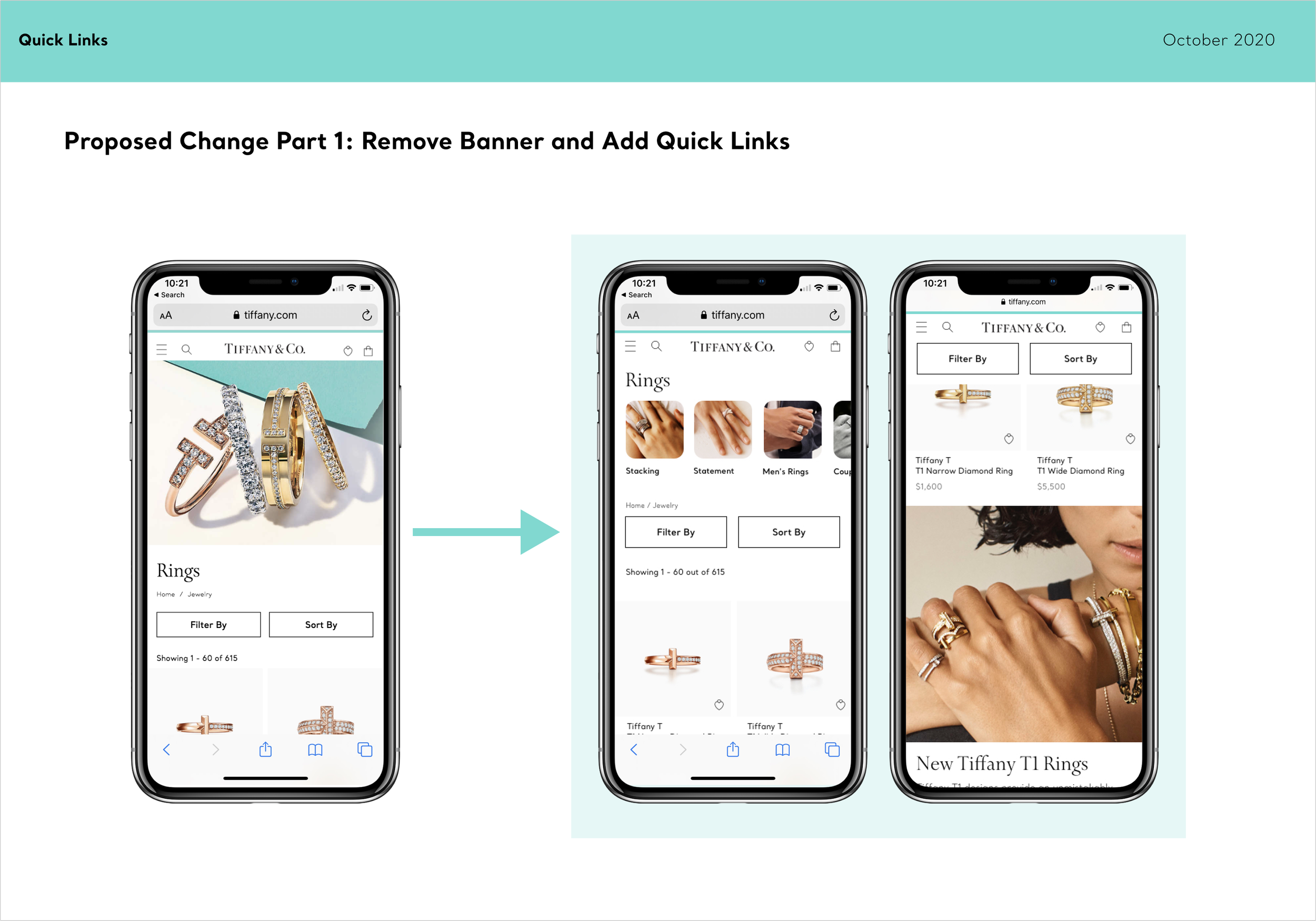
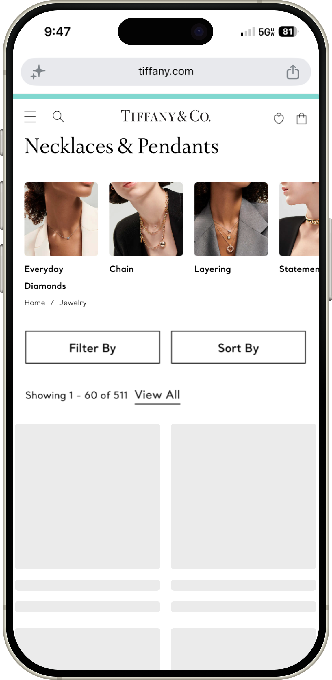
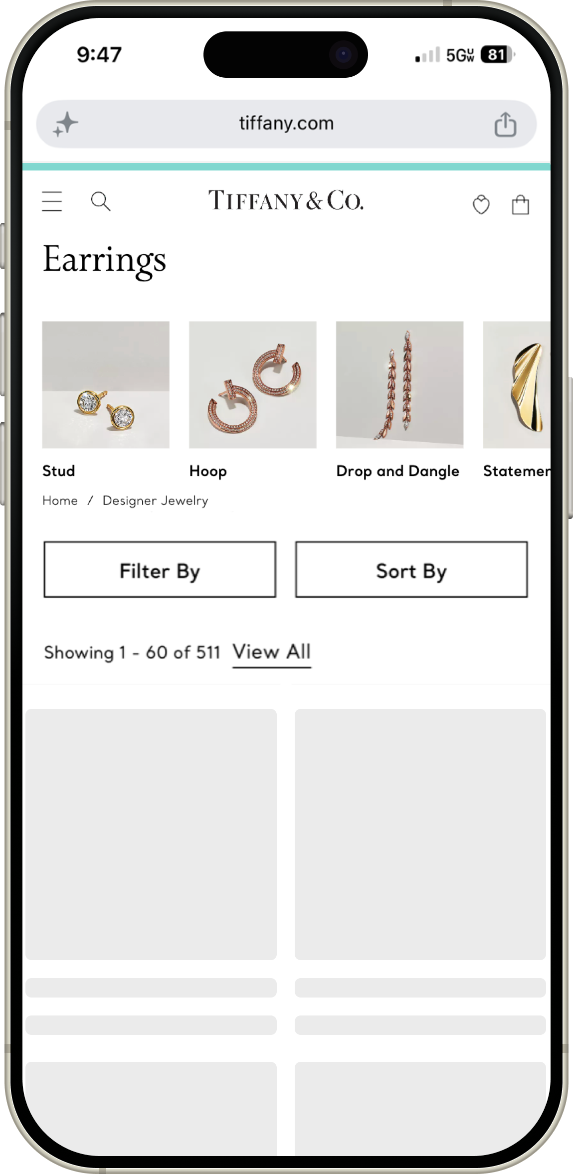
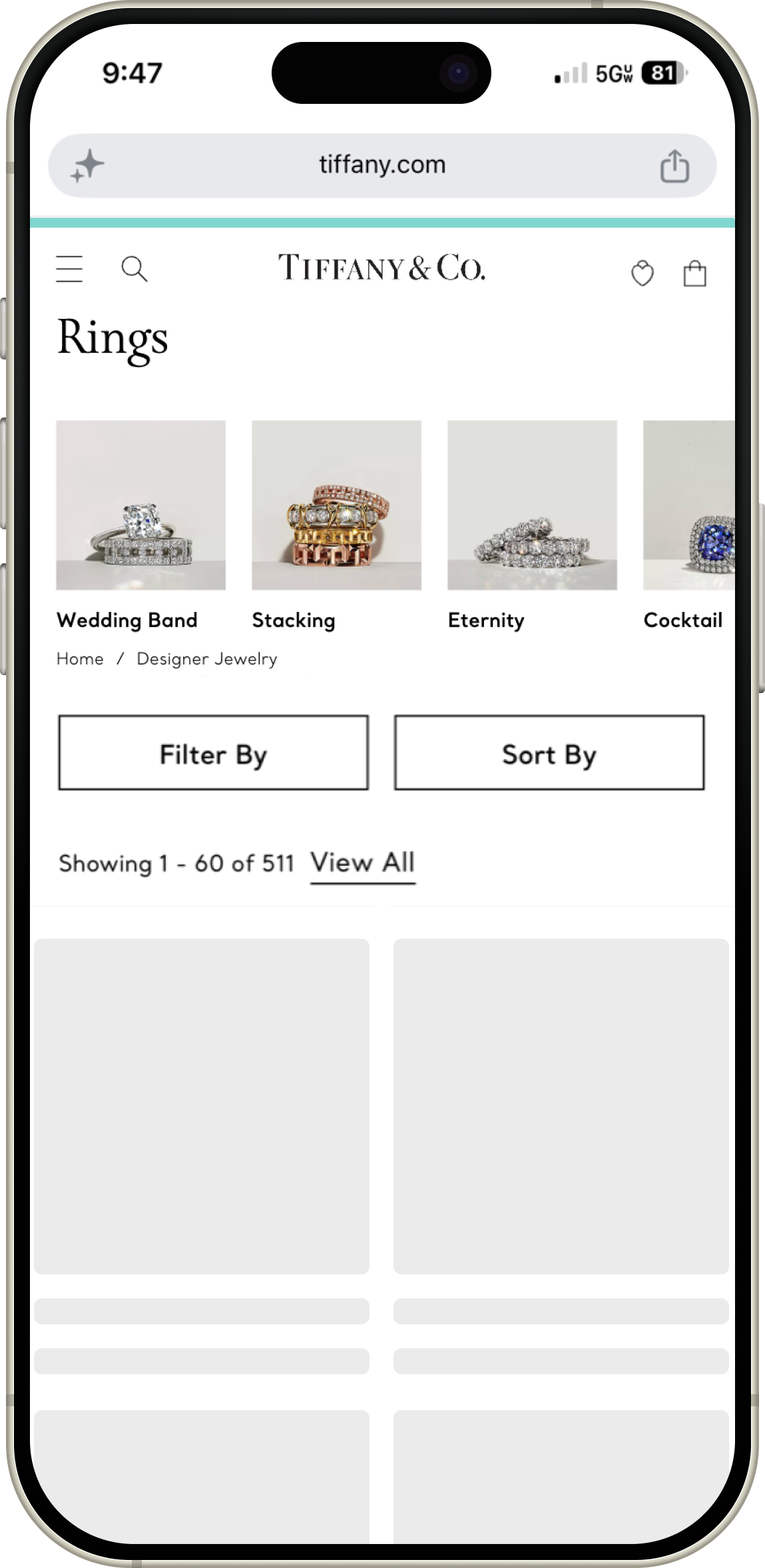
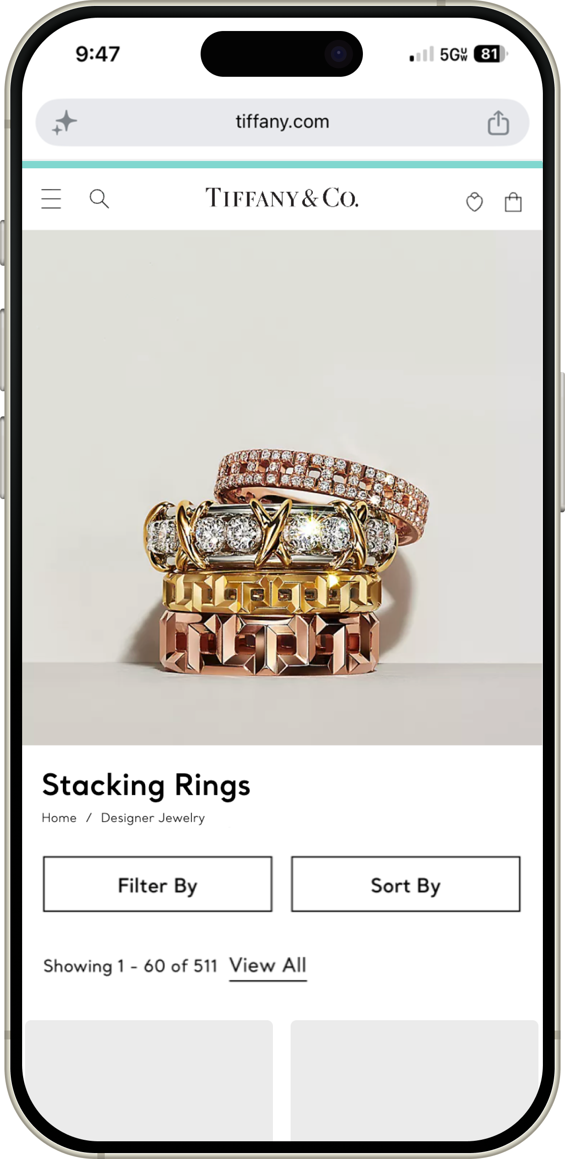
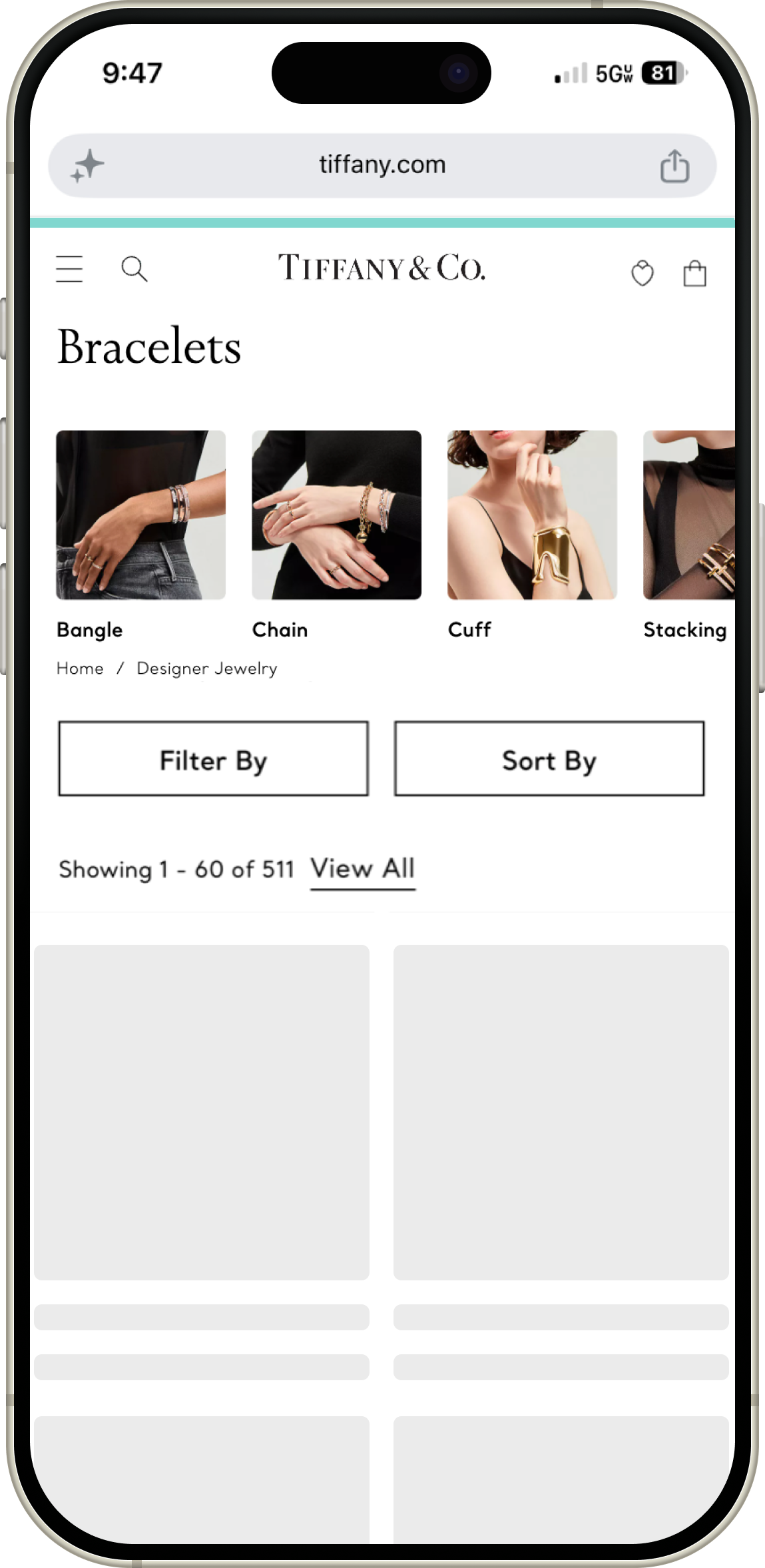
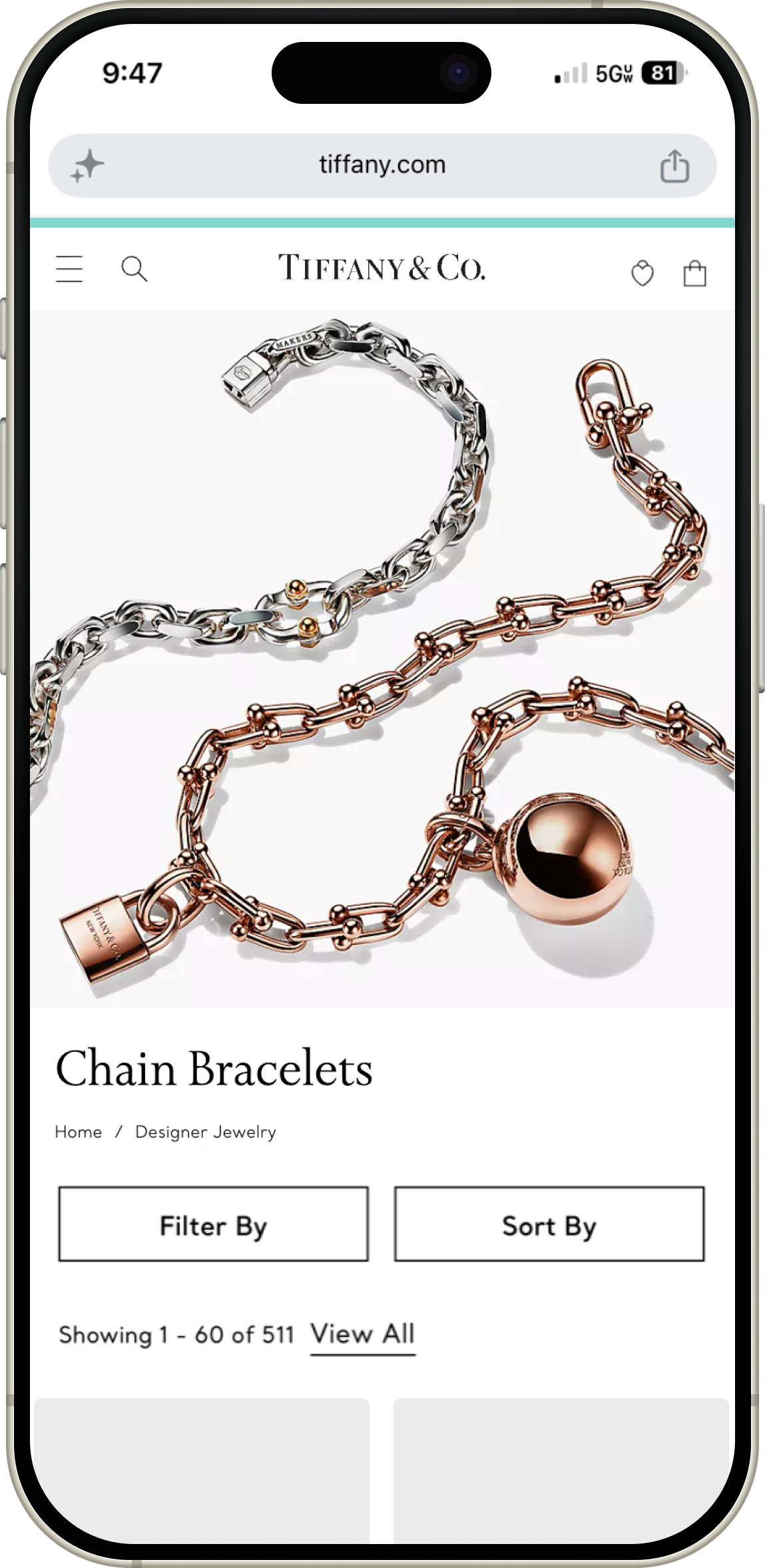
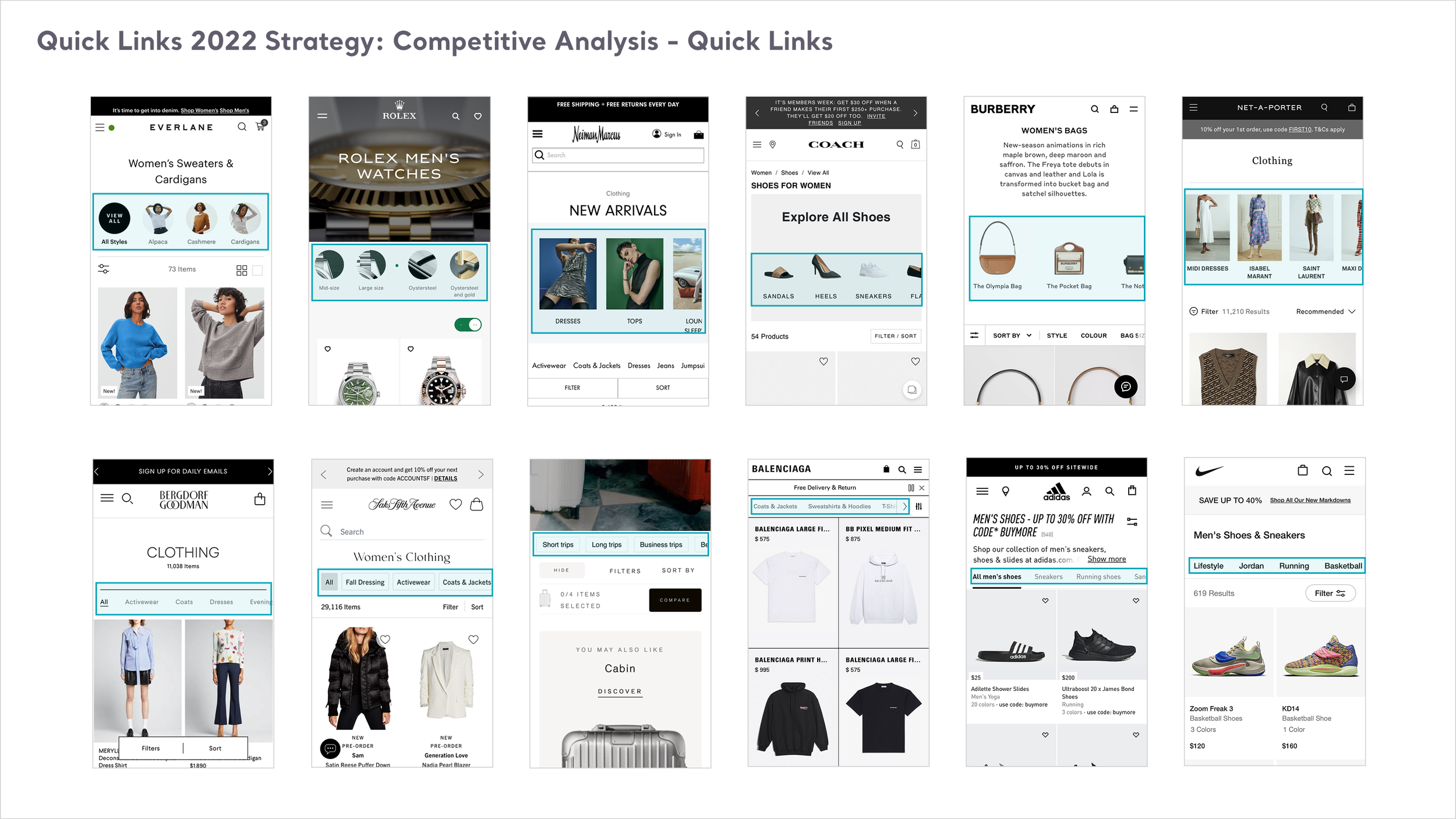
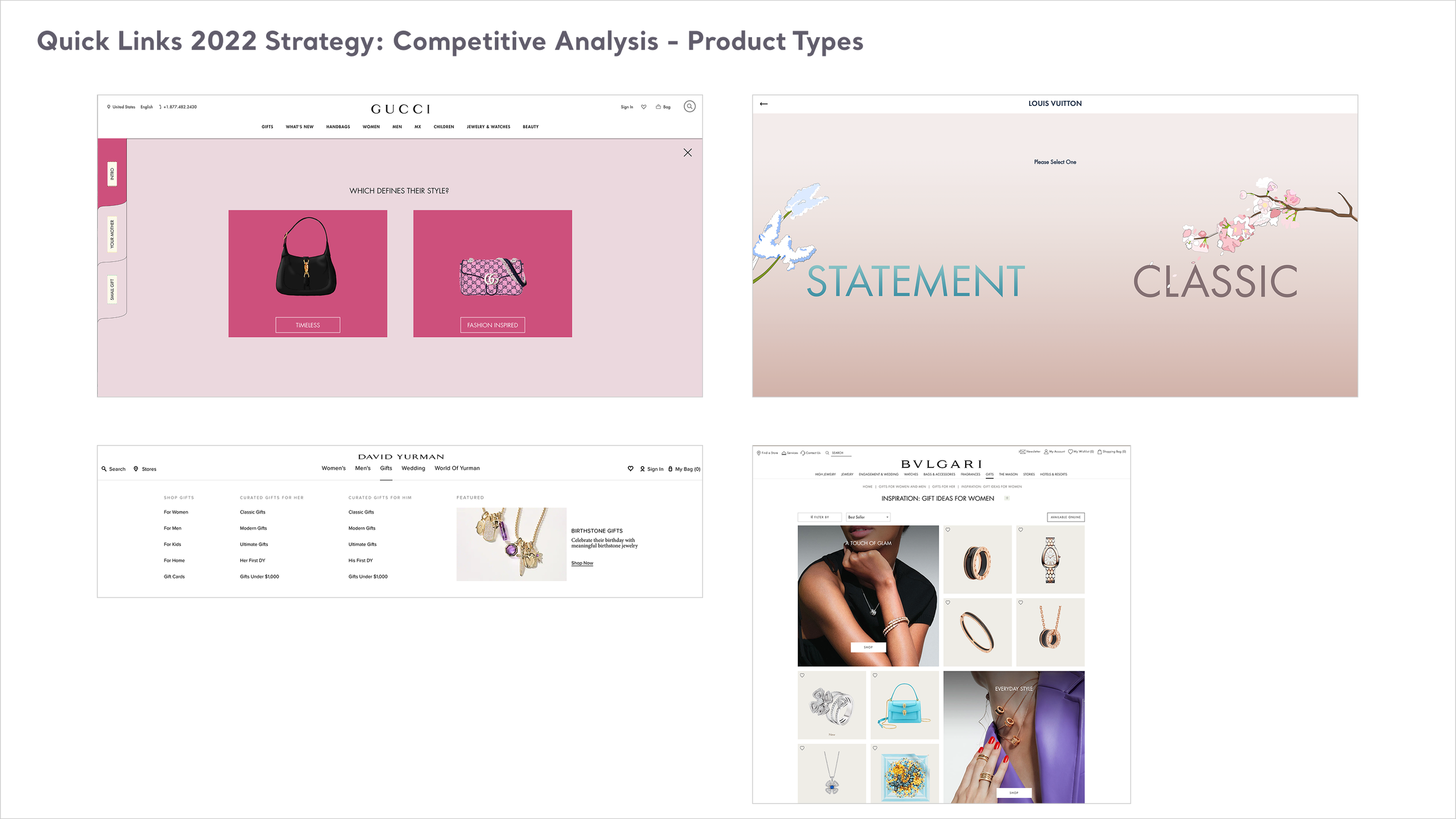
To solve this drop-off without disrupting the clean, iconic look of the site, I pioneered a mobile-first, swipeable visual shortcut taxonomy positioned strategically above the fold.
Synthesizing Search Intent
Decoding Customer Behavior: I collaborated closely with our Merchandising and analytics teams to analyze exactly what users were seeking. We audited search trends across external SEO, the internal site search bar, and frequently used filtering categories.
Determining Content Strategy: Our collaborative sessions focused entirely on defining what high-value collections should populate the quick links. While the cross-functional team helped align the retail priorities, I independently owned the end-to-end UX architecture, interaction design, and visual styling.
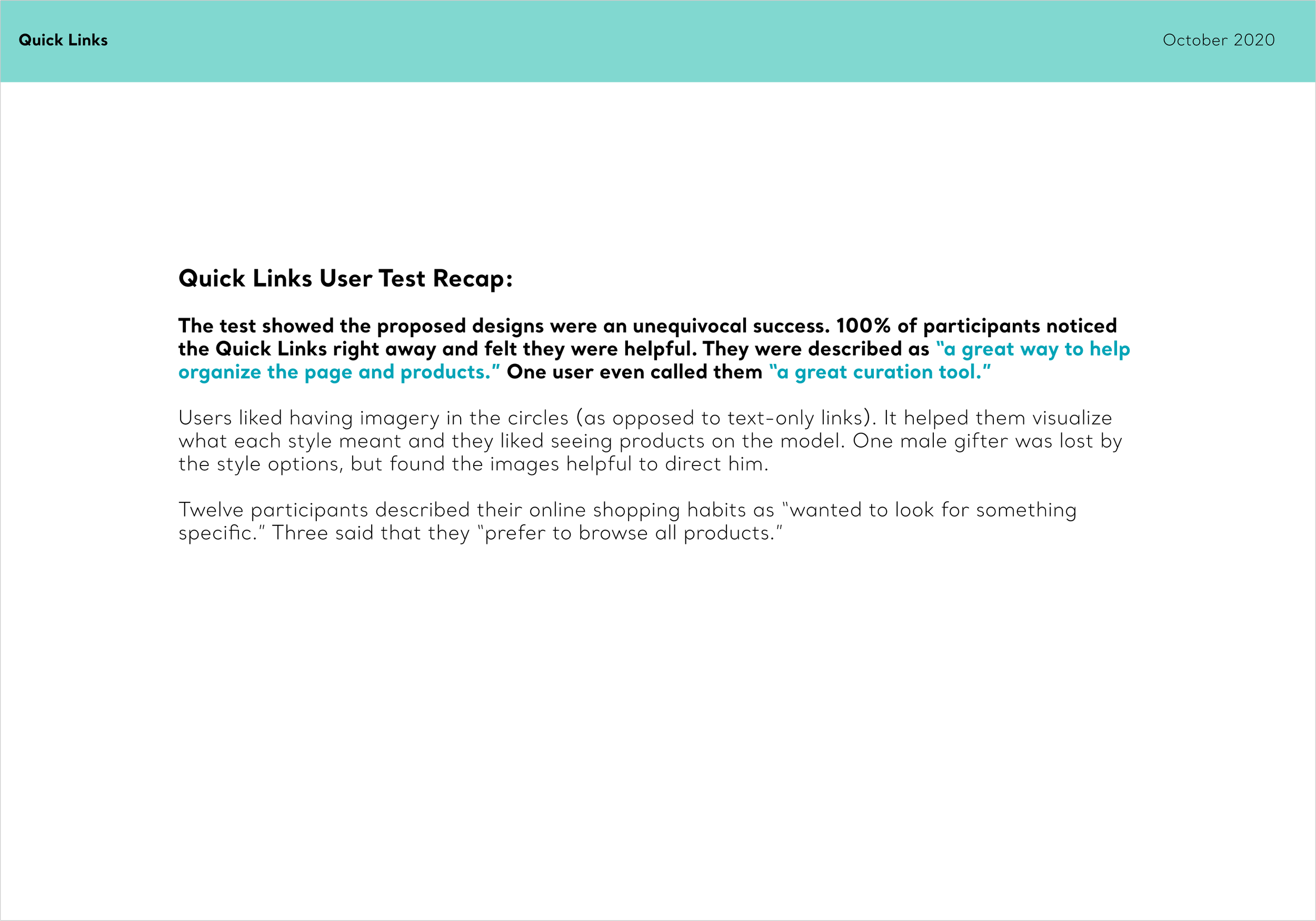
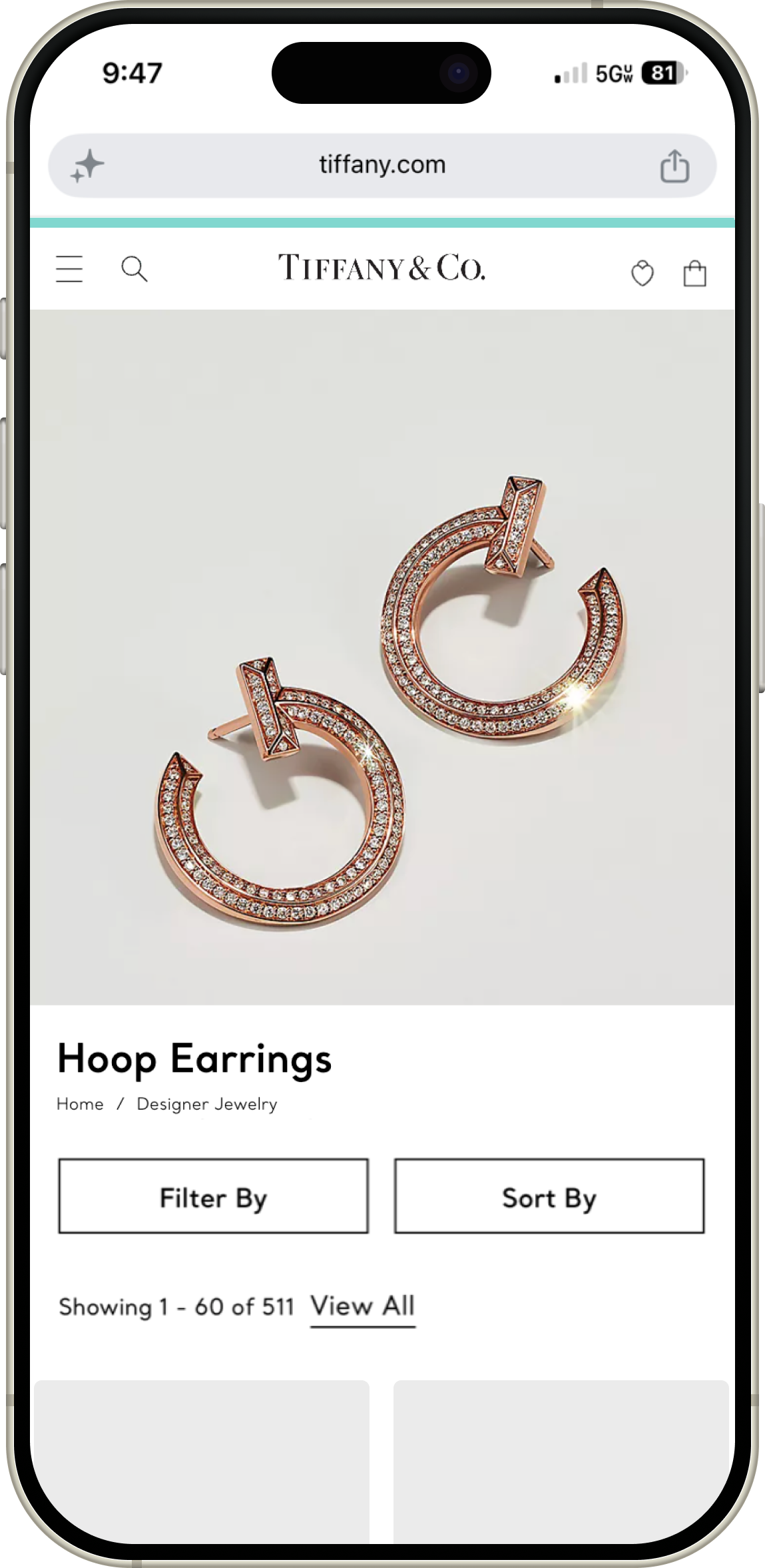
Proving the Concept: Our process was deeply rooted in validation. I mapped out optimized user journeys to show how we could radically shorten the path to a product detail page. We first watched users interact with our prototypes to ensure clarity, and then ran a live A/B test on the high-volume site to measure real-world commercial impact before rolling the component out globally.
UX Rigor
Taxonomy, Flows, and Usability Principles
Our digital blueprints were anchored directly in Nielsen Norman usability heuristics, focusing heavily on Recognition Rather than Recall (Heuristic #6) and Flexibility and Efficiency of Use (Heuristic #7).
I mapped out comparative user flows detailing the exact difference between the legacy multi-step filtering journey and our new single-tap visual shortcut path. By replacing dense, hidden dropdown menus with a clean, swipeable horizontal shortcut bar featuring a blend of text-based titles and stylized imagery, we lowered cognitive barriers. Users could instantly recognize their desired style and jump directly to it, making the mobile shopping journey feel entirely effortless.
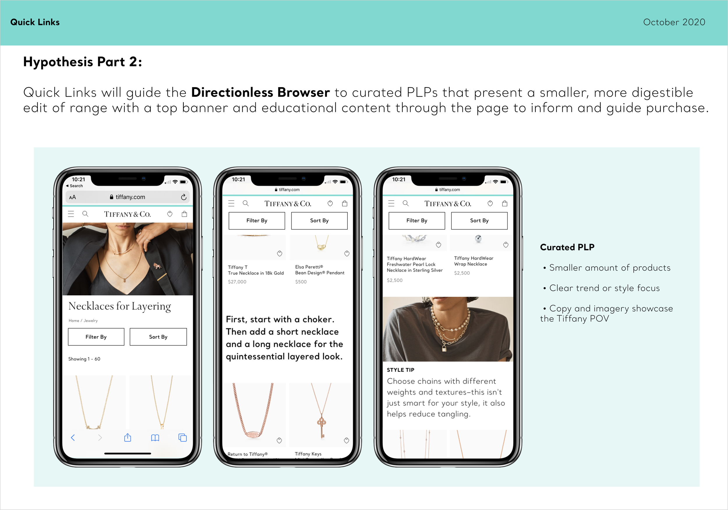
Testing Revelations and Future Strategy
While the concept was enthusiastically received across the enterprise, our interactive prototyping phase revealed a critical user experience pivot point regarding internal brand language.
Bridging the Gap Between Luxury Jargon and Customer Clarity
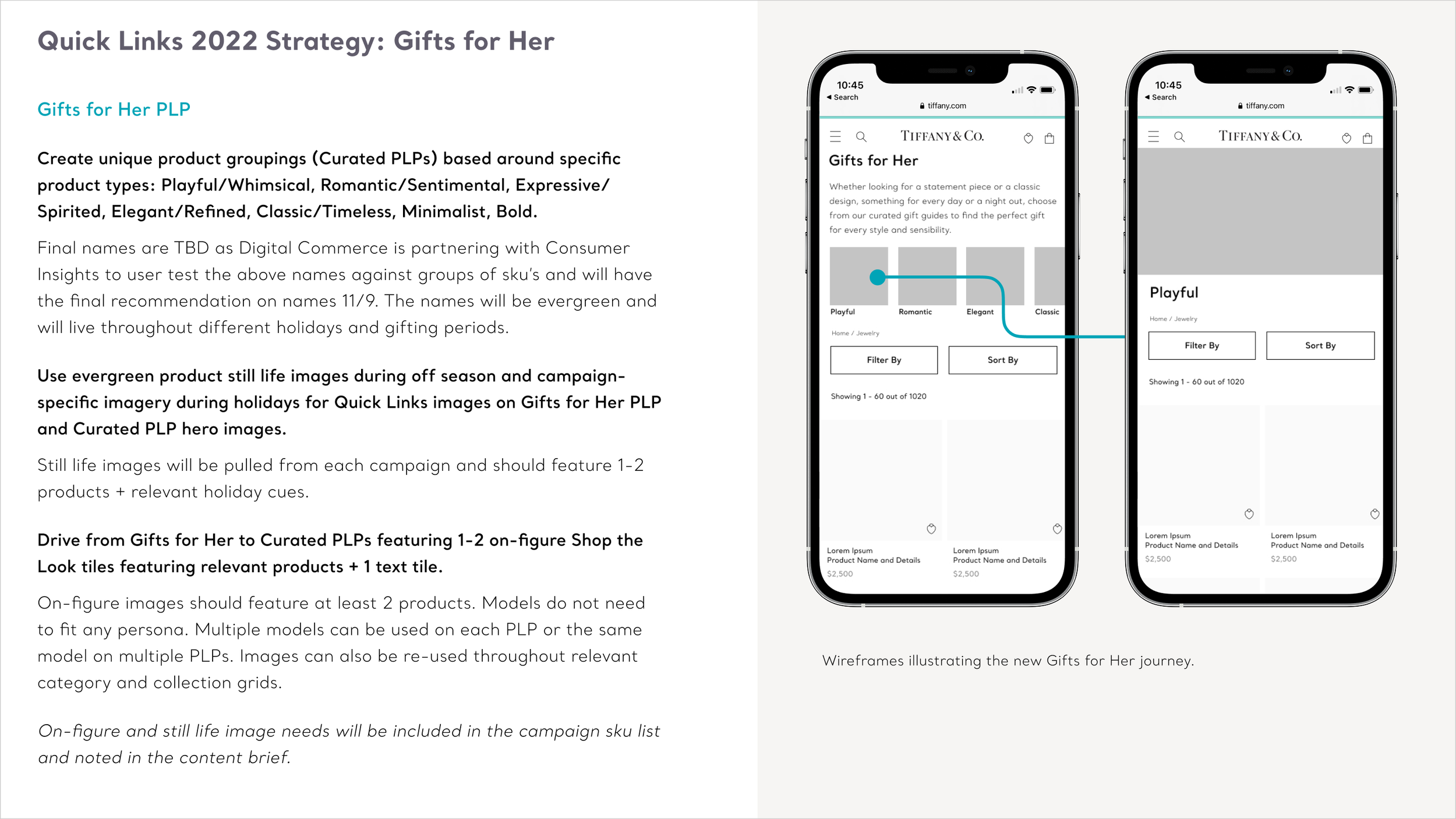
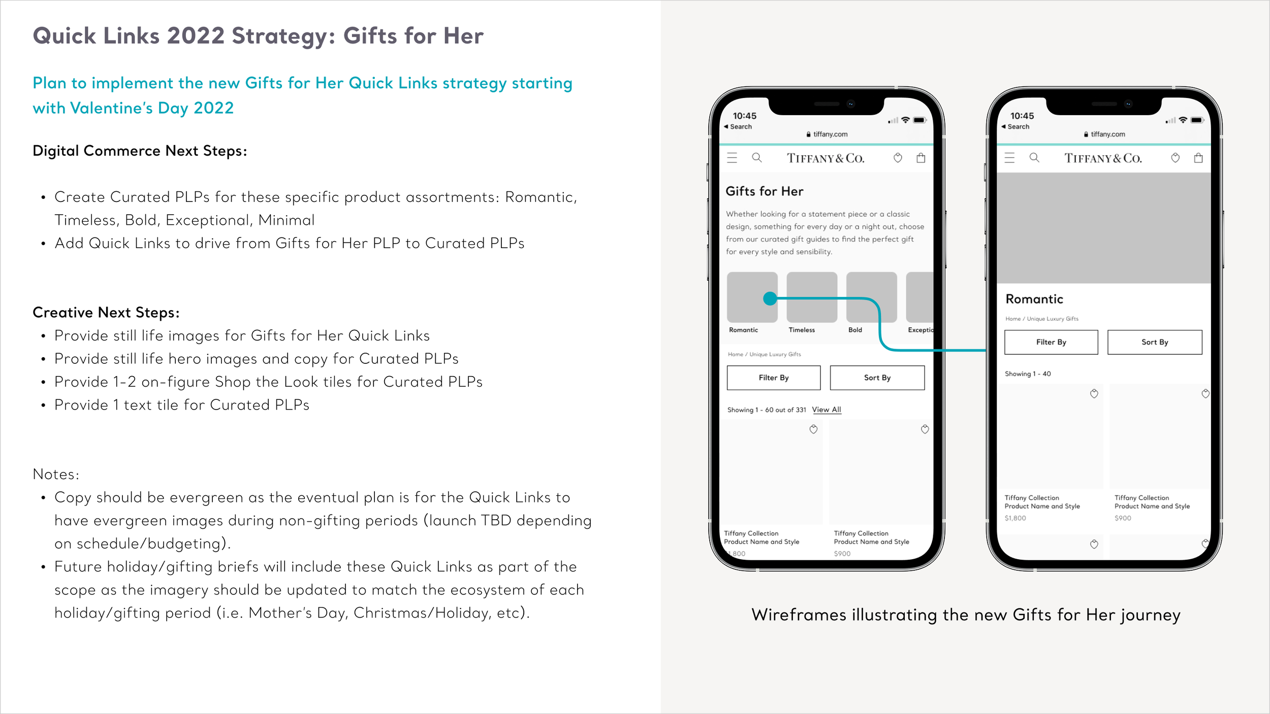
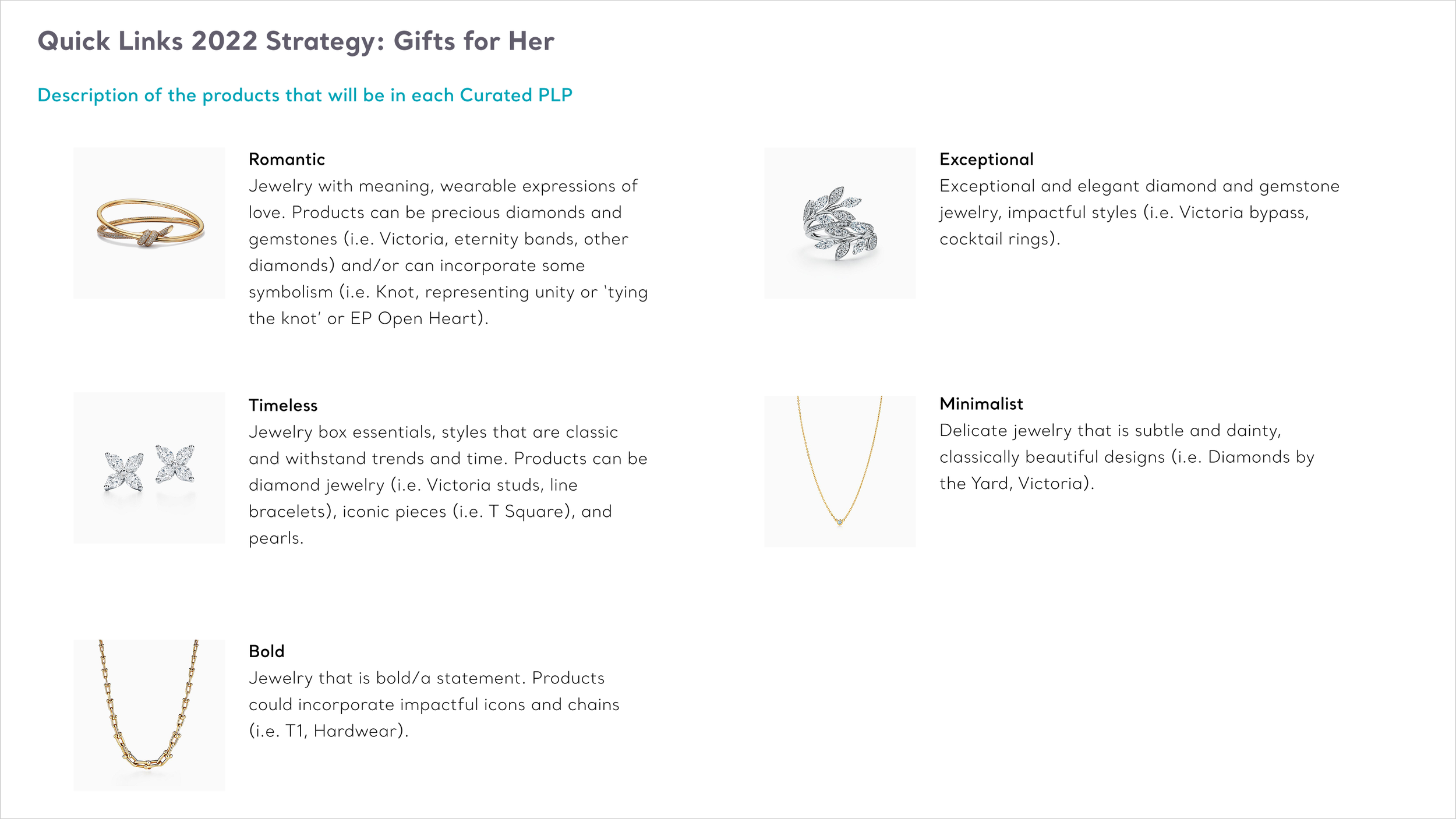
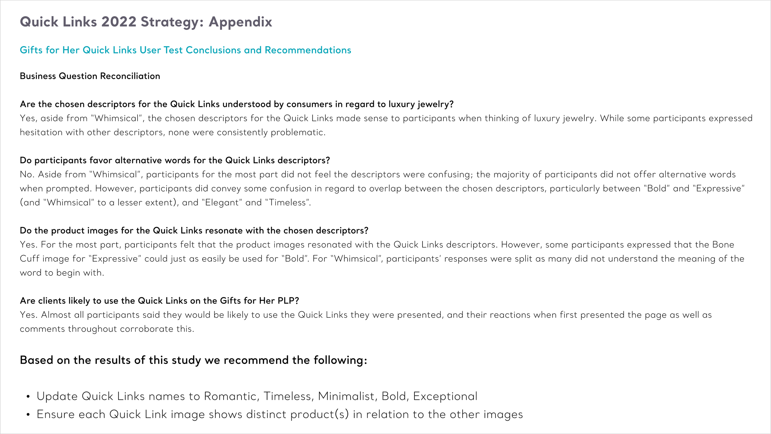
During usability testing for a planned expansion into our highly complex Gifts for Her category, we discovered a major disconnect. Users repeatedly struggled with our internal, industry-specific terms for jewelry styles and structures. When clicking certain links, customers were confused or dismayed by the products they found because the industry naming conventions did not align with their mental models.
I used these qualitative insights to advocate for the user, fine-tuning the visual taxonomy and copy. By translating rigid internal industry jargon into clear, natural, and customer-facing language, we ensured that every link felt intuitive and instantly understandable.
Establishing Long-Term Merchandising Governance
To support future catalog growth, I codified a flexible administrative template for the merchandising and editorial teams. I engineered strict design guardrails that required a minimum of 3 and a maximum of 6 curated slots per category page. This framework gave internal partners the agility to swap current trends and product sub-categories out autonomously without breaking the horizontal grid, overloading the viewport, or causing design system drift.
Impact and Results
“A great curation tool.”
—Test Participant
Complete Qualitative Success with a 100% helpfulness rate during usability testing.
+50%
Revenue Per Visit Spike achieved for the core Bracelets category.
+23%
Increase in PDP Reach over baseline control pages.
By transforming complex retail search data into an intuitive, visual navigation system, we proved that simplifying choice architecture can drastically accelerate funnel velocity while elevating the digital luxury experience.
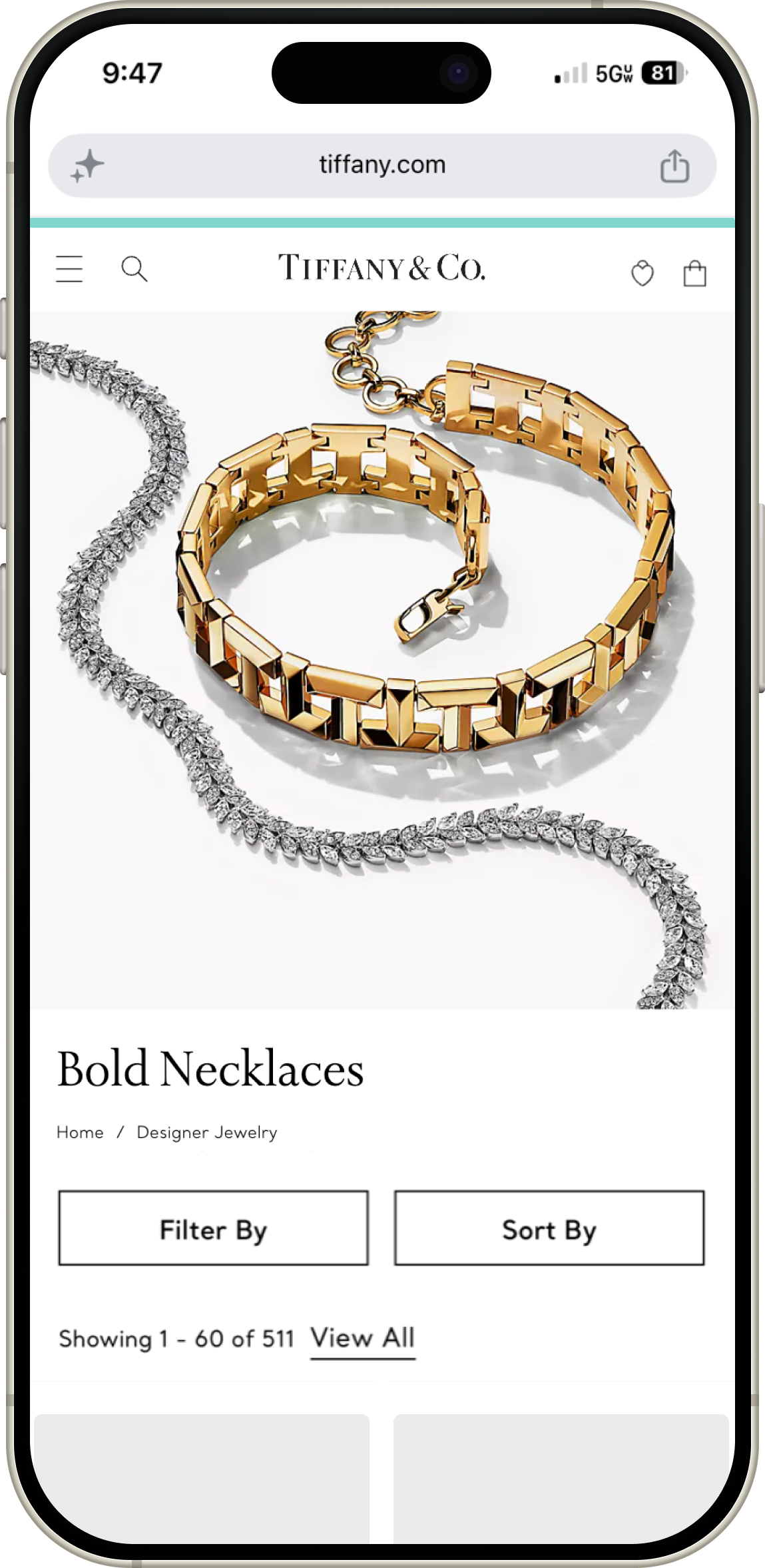
Massive Revenue-Per-Visit Expansion: Triggered an immediate commercial lift across core categories, delivering a staggering +50% spike in Revenue Per Visit for Bracelets and a +21% lift in RPV for Necklaces & Pendants.
High-Ticket Strata Growth ($1K+): Successfully qualified buyer intent and guided users toward premium assortments, causing Necklaces & Pendants traffic to heavily over-index in product views and completed orders within the $1,000+ investment price tier.
Deepened Funnel Conversion: Accelerated customer progression down the purchase funnel, yielding up to a +23% lift in PDP reach and up to a +20% increase in Add-to-Cart rates over legacy layouts.
Responsive, Mobile-First Performance: Optimized the shopping journey for a reality where 70% of users browse on mobile and 59% land directly on category pages, replacing hidden filtering dropdowns with a low-friction visual shortcut above the fold.
Global Standardization: Successfully lowered cognitive barriers for gift-buyers through clear, user-validated visual taxonomy, leading to the permanent codification of the Quick Links framework in the global design system.
Next Case Study:
Tiffany & Co.
Bridging Content and Commerce on the Mobile Homepage →