TIFFANY & CO.
Designing Strategic Homepage Zones
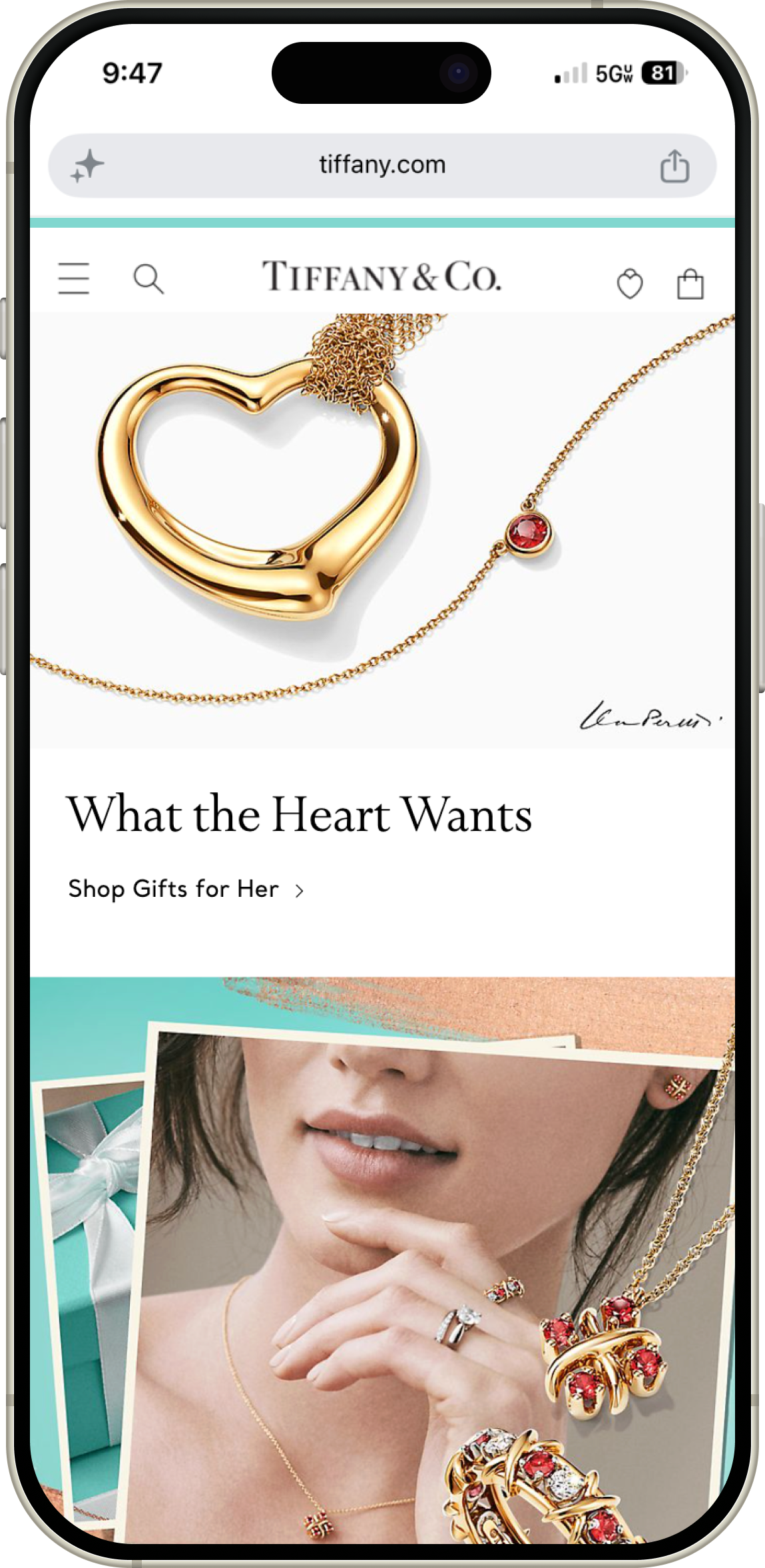
Balancing competing marketing goals with user intent required a complete homepage redesign. This strategic layout drove a 36% lift in average order value, pushed mobile content clicks above 22%, and achieved a 100% mobile navigation score.
Role
Senior Digital Product Designer
Focus
Strategic Leadership, Strategic Hierarchy, Design Governance, Cross-functional Management
Timeline
2020
Team
Product Management, Engineering, Marketing, Content Strategy, Creative
The Challenge
The Cross-Functional Marketing Tug-of-War
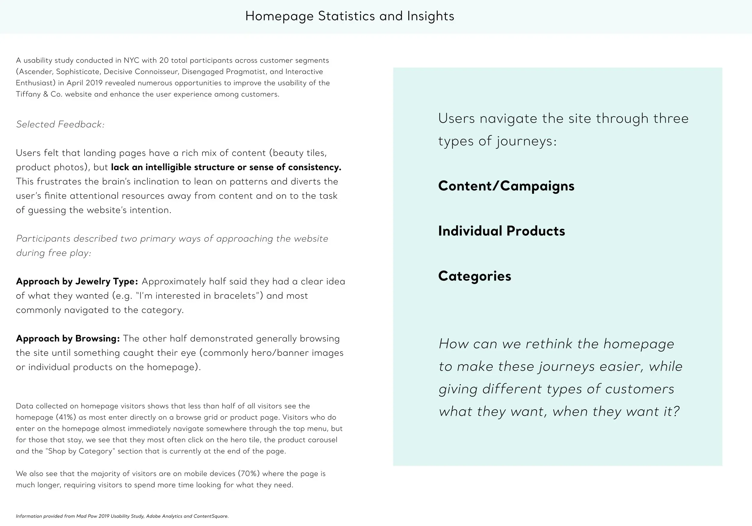
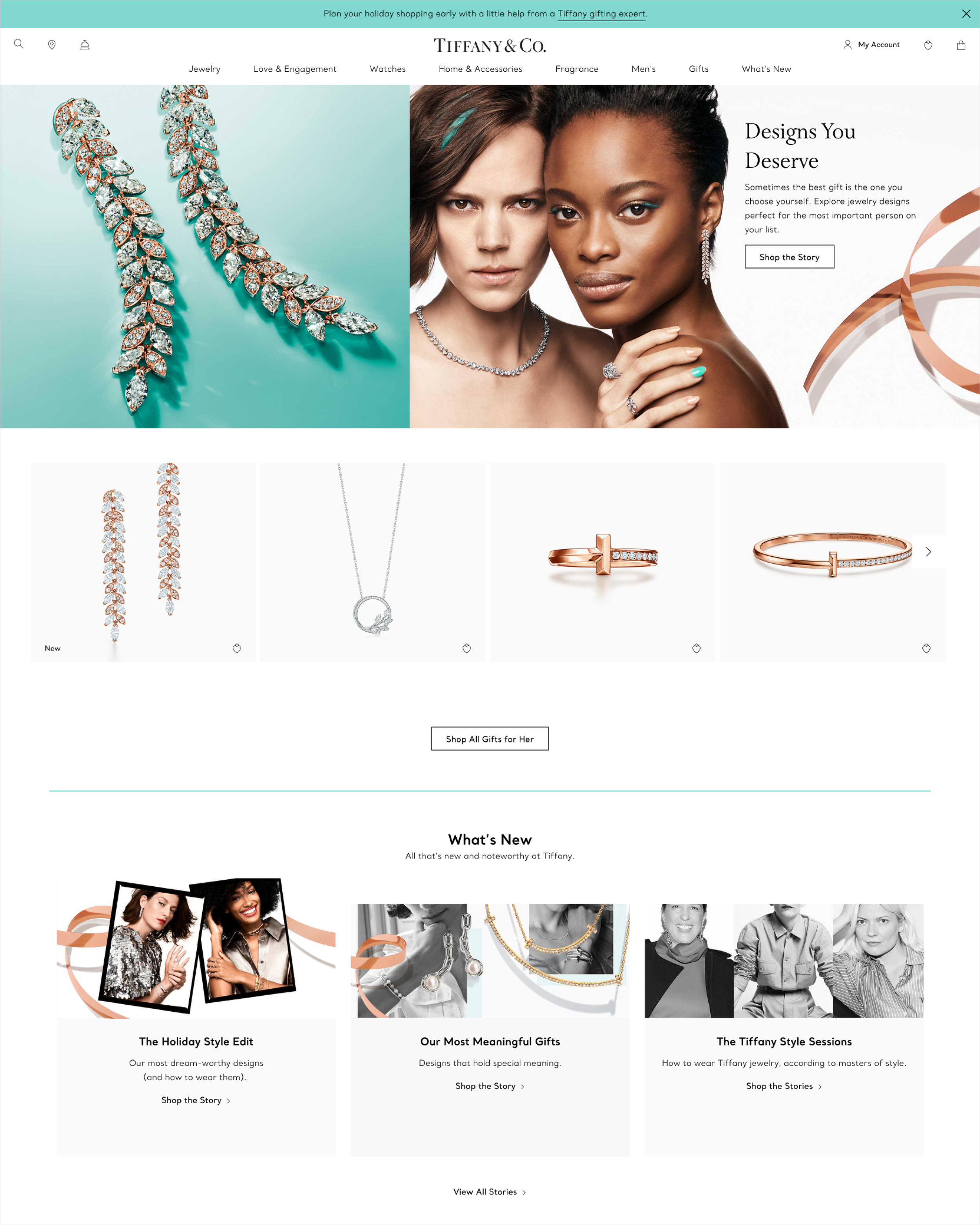
With an array of high-stakes global campaigns constantly vying for premium real estate, the Tiffany & Co. homepage had become a complex internal battleground for competing marketing messages. The legacy interface relied on long, repetitive, full-width banners of a similar style, causing the page to grow continuously longer.
While the top slots received heavy interaction, the middle of the page became a dead zone where users scrolled aimlessly through dense blocks of uncurated stories. This fragmented approach left our digital landing experience without a clear sense of focus. Customers struggled to find an intuitive starting point, forcing high-intent buyers to scroll all the way to the bottom of the page just to find basic navigation links. As Senior Digital Product Designer, I spearheaded the Homepage Zones initiative to transition away from this first-come, first-served content layout. We needed a disciplined structural framework that could satisfy internal marketing demands while providing an effortlessly navigable journey tailored directly to our target customer segments.
The Approach
Design Diplomacy Driven by Empirical Data
To build a layout strategy that competing business units would actually agree to, I partnered with our Product and Marketing teams to transition the homepage into a modular zoning system governed by predictable placement rules.
Dismantling Internal Real Estate Politics
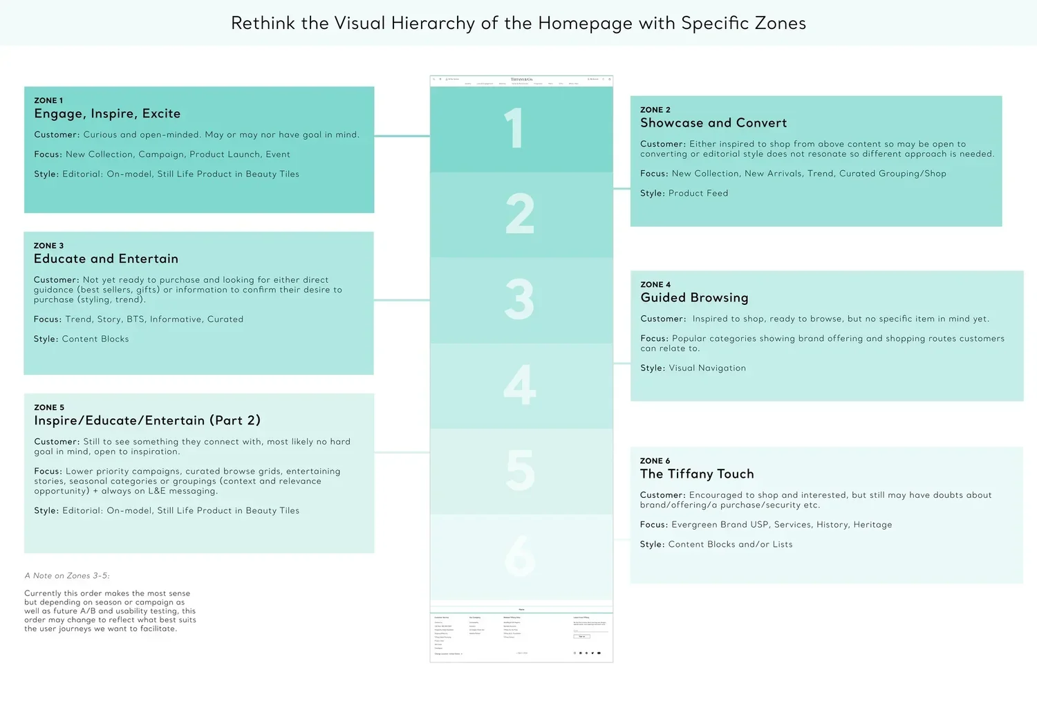
The Unified Blueprint: While the brand team already maintained a high-level hierarchy for global and regional campaigns, I translated their business priorities into a simplified, numbered layout placement system mapping directly to physical viewports.
Securing Executive Buy-In: To win over stakeholders who were protective of their screen real estate, I bypassed subjective design arguments and let objective user data do the talking. I partnered with our Consumer Insights team to run a rigorous usability test evaluating our new zoned layout against the legacy homepage.
Leveraging Core Systems: Because I had independently designed the site's entire core component library during our original platform launch, I was intimately familiar with how our digital assets behaved. This allowed me to completely reorganize the page architecture in a clean, consistent manner without requiring extra engineering overhead or development cycles.
UX Rigor
Methodological Testing and Persona Architecture
Our research framework was heavily anchored in Nielsen Norman usability heuristics, focusing specifically on Consistency and Standards (Heuristic #4) and Aesthetic and Minimalist Design (Heuristic #8) to eliminate visual noise.
Rather than relying on casual feedback, we executed a structured usability study with an evenly balanced sample of n=28 total US luxury respondents. To ensure absolute data integrity, every participant was verified through a strict screener requiring a proven luxury purchase history of $500 or more.
The Target Persona Split
The Sophisticate Segment (n=14): Representing our established, high-net-worth demographic, screened at an age bracket of 30 to 60 with a household income of $125K+.
The Ascender Segment (n=14): Representing our high-growth, aspirational demographic, screened at an age bracket of 18 to 40 with a household income of $80K+.
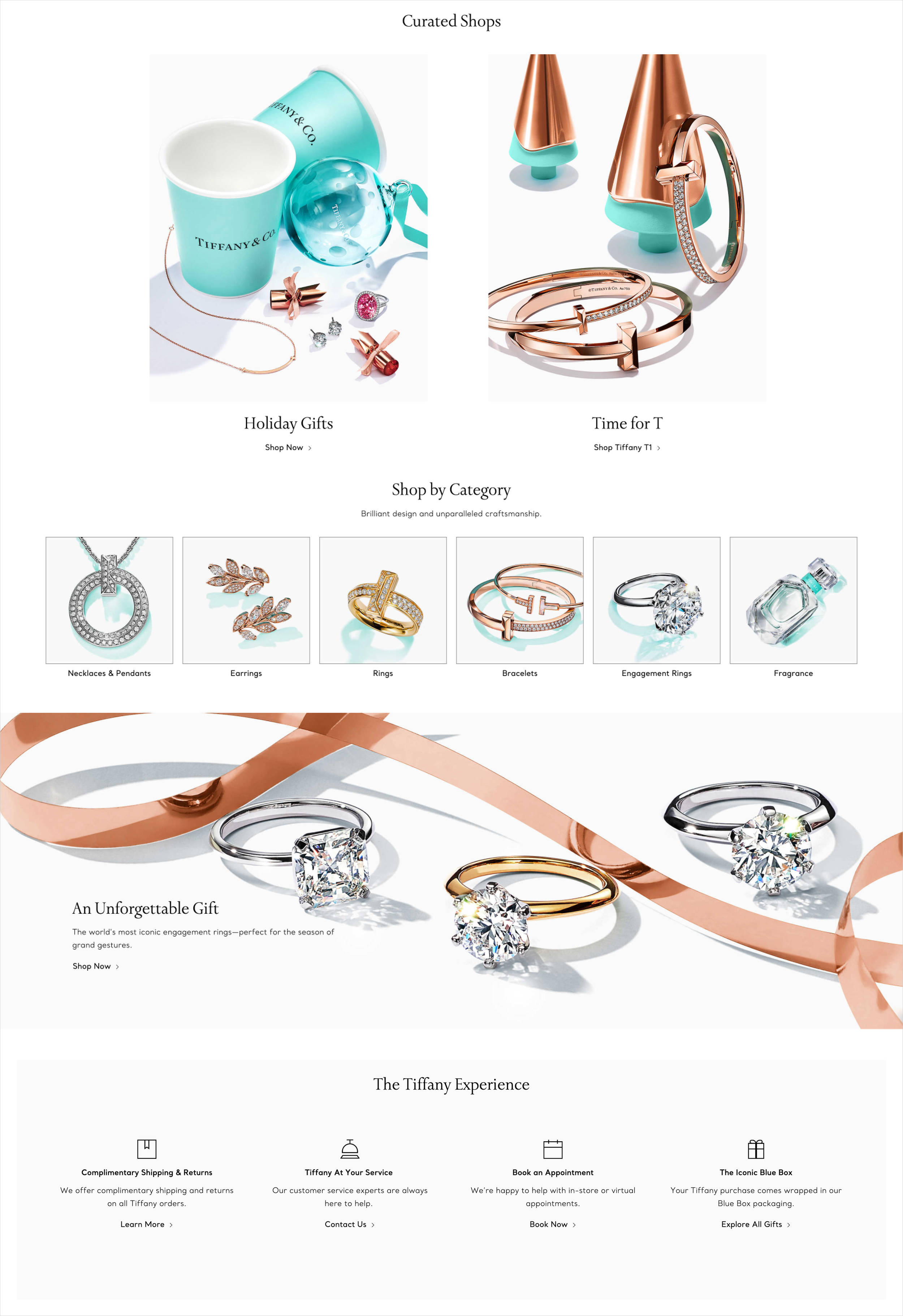
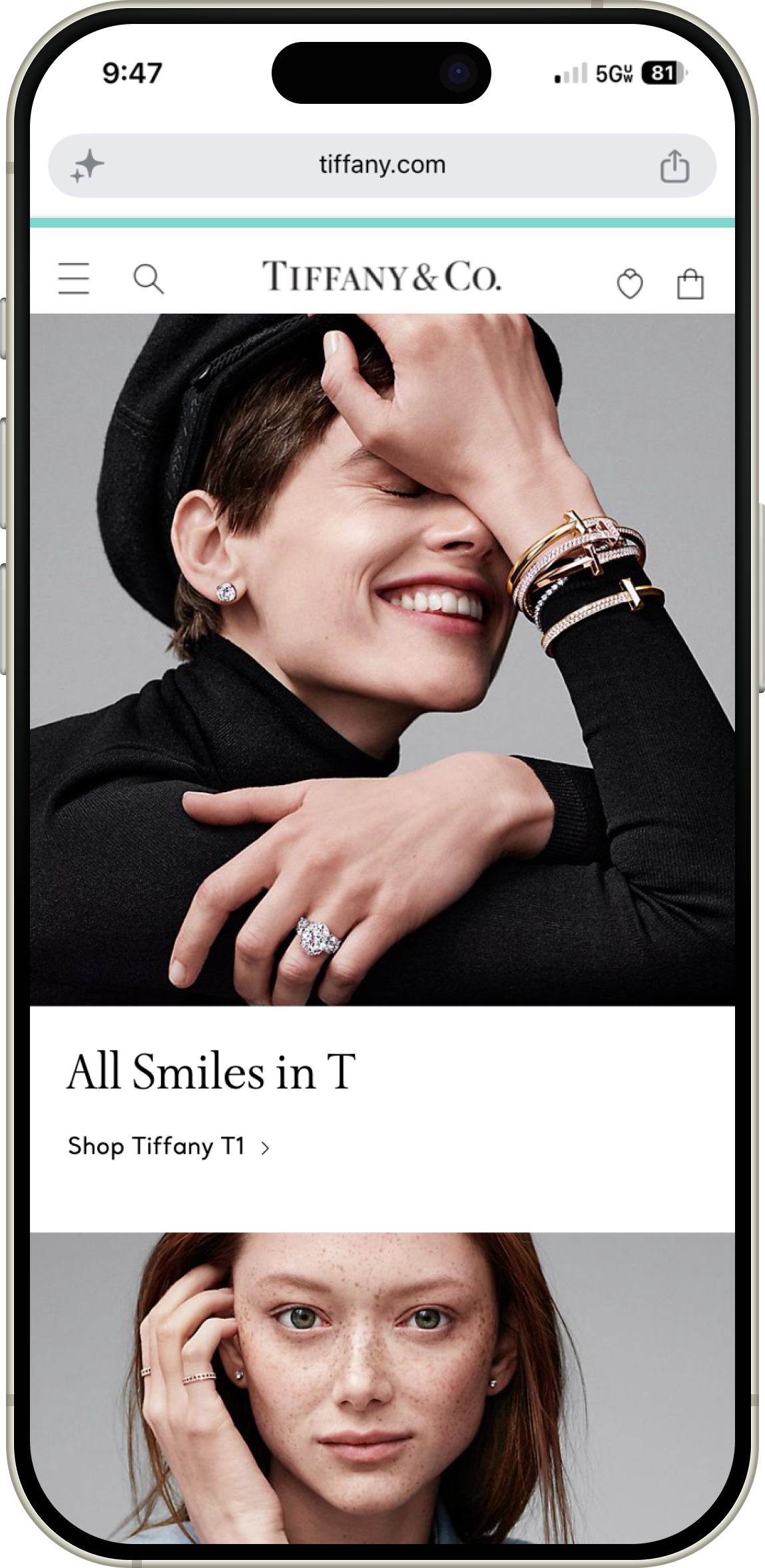
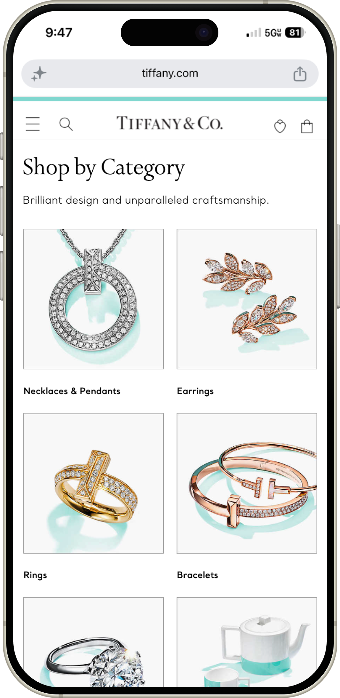
Both user groups were split evenly across desktop and mobile devices to evaluate viewport performance. Instead of traditional step-by-step user flows, I used strategic persona matching to clean up the layout clutter. The high-impact, immersive hero zones at the top of the page were structured to capture the instant trend-discovery needs of the Ascender shopper, who noted that they loved seeing what was new immediately upon landing. Conversely, the deeper content zones were organized to provide the guided, tiled category browsing that the Sophisticate expected, pulling the critical Shop by Category component up from the bottom of the page into a prominent, visual grid layout.

Technical Collaboration and Long-Term System Governance
The ultimate victory of this project was engineering a permanent design governance framework that protected both the user experience and the brand's premium aesthetic over the long term.
By establishing an objective, value-based roadmap that mapped campaign tiers directly to predefined homepage zones, we completely eliminated internal real estate politics and accelerated content deployment cycles. Regional content teams across 26 international markets gained the complete freedom to swap or hide assets autonomously via the CMS to fit local cultural calendars. Because the structural layout boundaries were mathematically locked into the core template, local teams could update their pages independently without ever causing layout shifting, breaking the responsive code, or creating design system drift.
Impact and Results
“Clean, modern, elegant.”
—Test Participant
Explicit User Preference documented with the vast majority of luxury buyers choosing the new layout.
+36% AOV
Average Order Value Lift from $434 to $590, driven by a shorter, cleaner layout that fast-tracked shoppers into premium collections.
>22% Mobile Lift
Content Click Rate Acceleration on mobile web, outperforming the desktop click rate of 14%.
By transforming a cross-functional bottleneck into an objective, data-driven zoning framework, we proved that strategic design governance can eliminate internal friction while radically elevating brand sentiment for the consumer.
Exponential Revenue Value: Drove a massive shift in cart optimization, lifting the average order value from $434 up to $590 as users seamlessly encountered higher-end merchandise.
Unprecedented Engagement Gains: Pushed mobile web content click rates above 22%, while simultaneously lifting desktop web content engagement to 14%.
Overwhelming Consumer Validation: Out of 28 high-spend luxury participants, 24 explicitly preferred the new zoned layout, praising the interface for feeling less lengthy and far more curated.
Flawless Mobile Navigability: Achieved a perfect 100% navigation success rate among mobile users, decisively validating the choice to elevate core category entry points from the bottom of the viewport.
Complete Brand Sentiment Turnaround: Successfully shifted consumer perception of the landing experience, completely replacing legacy descriptive keywords like busy, cluttered, and overwhelming with words like clean, modern, and elegant.
Dynamic Global Scaling Across 26 Regions: Successfully deployed the modular framework across all 26 global e-commerce sites, allowing regional teams to dynamically adjust content zones without risking layout drift.
Next Case Study:
Tiffany & Co.
Turning Dense Sustainability Reporting into an Elegant Digital Ecosystem →